
Is It Time to Raise Cash Again? My Read on the Market’s “Top-ish” Signals
Spotting Market Tops Is Hard – Here’s My Current Game Plan

This year I’ve found myself becoming more open to the idea of market timing – something I once thought of as a distraction, if not a dangerous habit. I wrote about this in what’s probably my favorite post of the year, From Soros to Buffett: Exploring the Art and Science of Market Timing. It was my attempt to bridge the gap between two seemingly opposing philosophies: the opportunistic trader who senses turning points and the long-term compounder who’s happy to ride out the waves. The more I’ve studied, the more I’ve come to appreciate that you don’t have to pick one camp. You can be an investor first and still pay attention to the tides.
From Soros to Buffett: Exploring the Art and Science of Market Timing

“The real voyage of discovery consists not in seeking new landscapes but in having new eyes.” —Marcel Proust
Since the April tariff sell-off, stocks have staged an almost suspiciously clean recovery. Back in mid-April, the S&P 500 was down roughly 15% for the year. Now it’s up 10% YTD – a 30% swing! – and it’s done so without much resistance. Up, up, up we go.
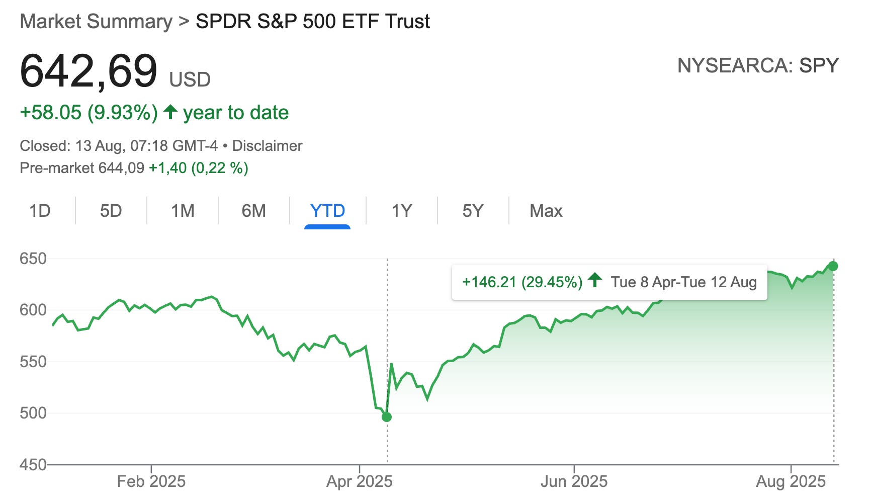
And that, honestly, is what worries me. Markets that rise without stumbling make investors feel invincible, and invincible investors tend to overlook risk until it’s too late.
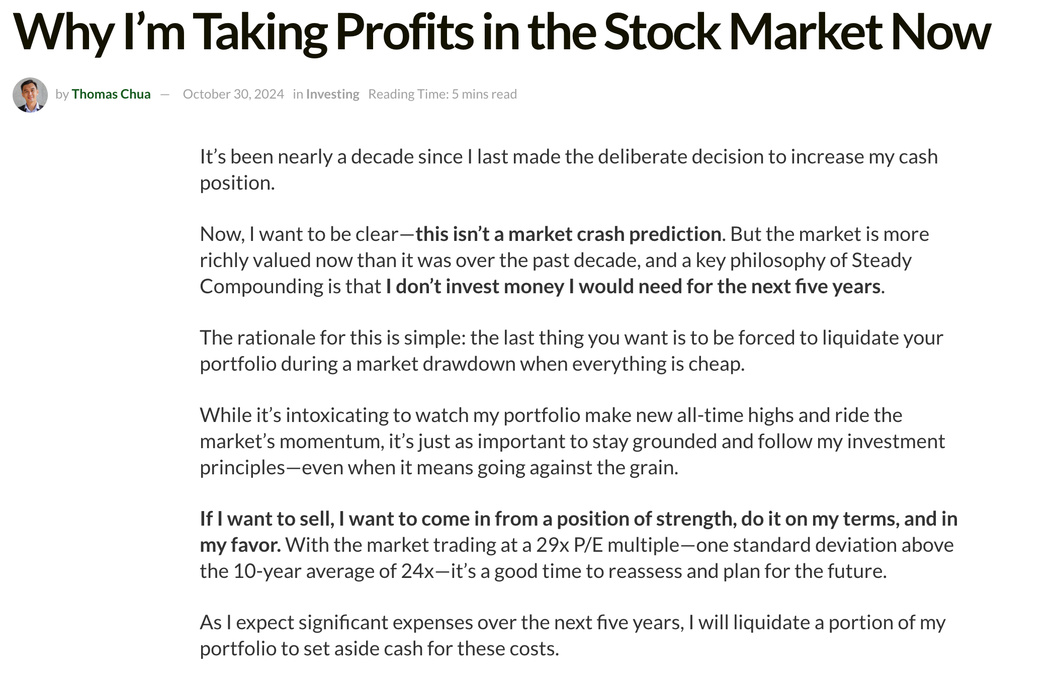
I was reminded of a post from Thomas Chua in late October 2024 titled Why I’m Taking Profits in the Stock Market Now. His timing wasn’t perfect – no one’s ever is – but if he used the April weakness to reinvest in quality companies that had been unfairly beaten down, it was still a good trade. Remember, while the S&P was “only” down 15% at the time, many of the so-called “tariff losers” were crushed far harder.
I had raised cash at roughly the same levels Thomas did, trimming or exiting positions in late February and early March. I’ll admit, I was a little frustrated that the deep pullback I was hoping for after Trump announced his ridiculous tariff scheme never fully materialized.
I wrote about this in May in You Missed the Bottom? Read This! Too Late to Buy? Too Early to Panic?, which touched on some of those same thoughts – I seemingly touched a nerve in this post, as to this day, it’s one of my most successful posts ever.
You Missed the Bottom? Read This!

The market has a way of humbling even the most seasoned investors. Just a few weeks ago, we were navigating a landscape riddled with uncertainty: tech stocks were reeling from the unexpected rise of DeepSeek, and the broader market was bracing for the economic implications of President Trump's aggressive tariff policies. The culmination of these factors…
But even after the sharp rebound in late April, I felt that the trades I made – selling lower-IRR positions and building into higher-expected-return opportunities – left my portfolio in a better place.
Just yesterday, I summed up my current view in a tweet:
“I think the value of cash is close to the peak we saw at the beginning of the year – if not exceeding it! This may sound a little counterintuitive to some, but when things feel like ‘smooth sailing,’ when stocks are soaring to extreme highs, the value of cash is actually the highest, as phases of euphoria and outright complacency often precede market downturns.”
And that’s the crux of this post: we need to ask if now – while it feels almost riskless to keep riding this rally – is the moment to raise cash again.
Yesterday’s action almost perfectly illustrates the mood: stocks rallied after a better-than-expected inflation report, indexes hit record highs, and traders celebrated the possibility that the Fed will cut rates at its September meeting. It’s optimism bordering on complacency. Again.
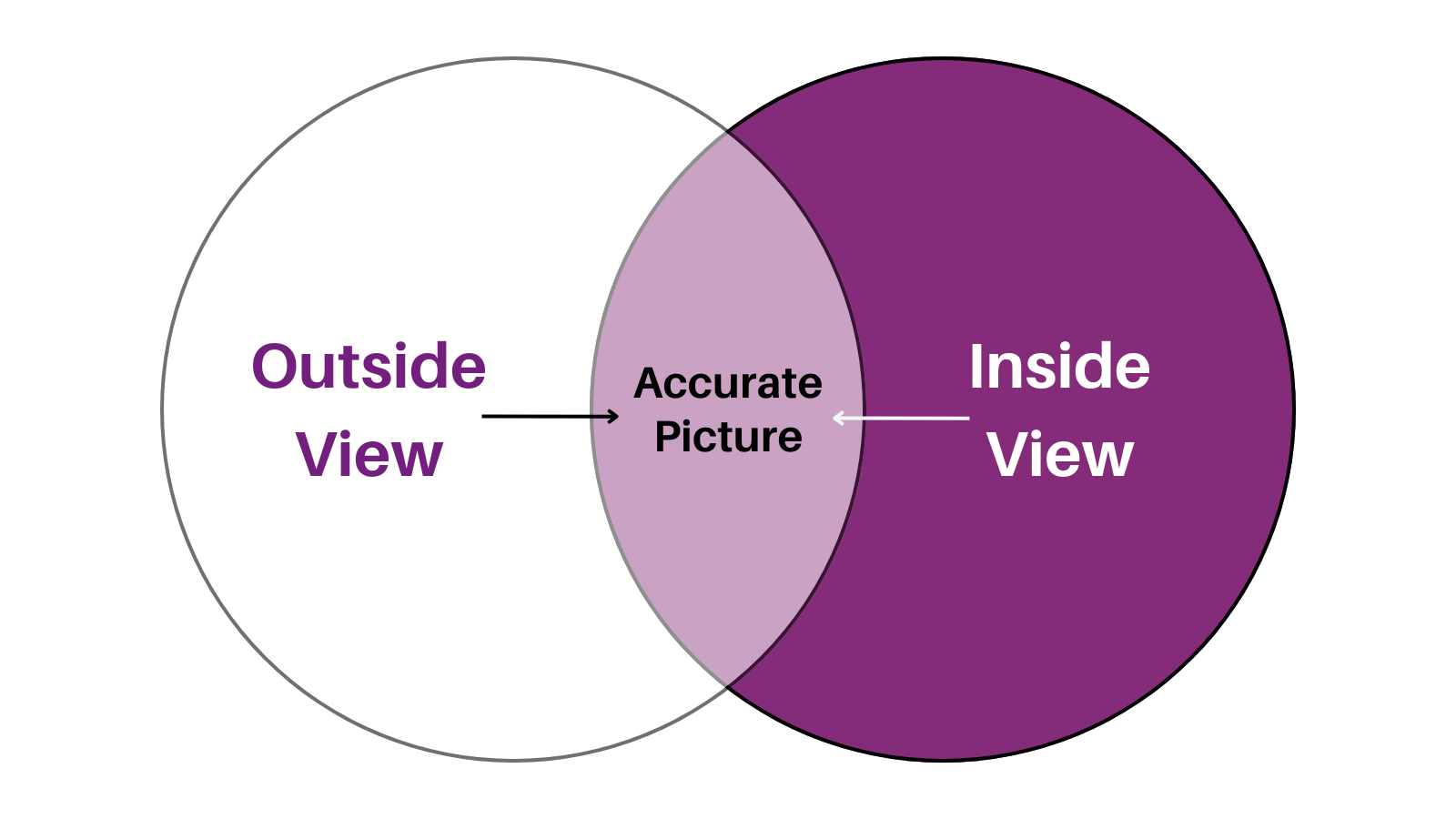
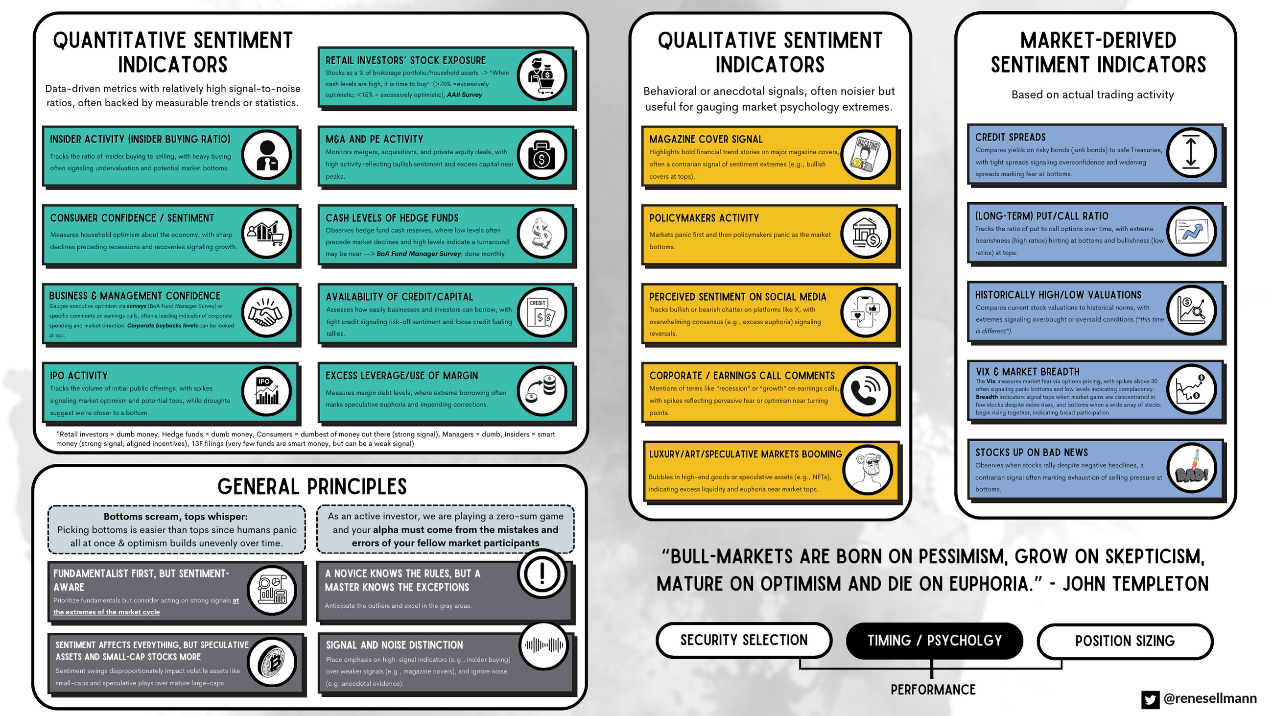
Here’s the thing. I think I have a decent sense – my gut feeling – of where we are in the market cycle most of the time; what I’d call my “inside view.” But I’ve also come to believe in layering on the “outside view,” which is often the more reliable way to frame and assess things. The outside view is all about data: quantitative and qualitative signals that can either validate or challenge your gut.
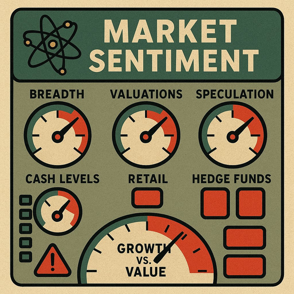
So, in this post, I want to put my hunch to the test. I’ll share the market dashboard I often reference – a visualization of key indicators I’ve posted before – and walk through what it’s telling us now.
Before we dive in, here’s what we’ll cover:
The specific market signals that suggest we’re back in high-risk territory, from valuation spreads to market breadth to speculative excesses.
How these signals have behaved in past cycles, and what history says about their reliability.
The counterarguments – signs that maybe it’s not time to get overly defensive just yet.
Why market tops are a process, not a moment in time, and how I’m thinking about my own cash position right now.
Disclaimer: The analysis presented in this blog may be flawed and/or critical information may have been overlooked. The content provided should be considered an educational resource and should not be construed as individualized investment advice, nor as a recommendation to buy or sell specific securities. I may own some of the securities discussed. The stocks, funds, and assets discussed are examples only and may not be appropriate for your individual circumstances. It is the responsibility of the reader to do their own due diligence before investing in any index fund, ETF, asset, or stock mentioned or before making any sell decisions. Also double-check if the comments made are accurate. You should always consult with a financial advisor before purchasing a specific stock and making decisions regarding your portfolio.
Reading the Market’s Dashboard: The Signals Flashing Today
So what makes me think now might not be the worst time to start raising cash? Let me begin with a chart I plan to reference repeatedly over the coming years – because if you truly internalize it, you’ll see the market in a different light. It’s simple, but it captures one of the hardest truths in investing: the riskiest times are rarely the ones that feel risky. They’re the ones that feel effortless.
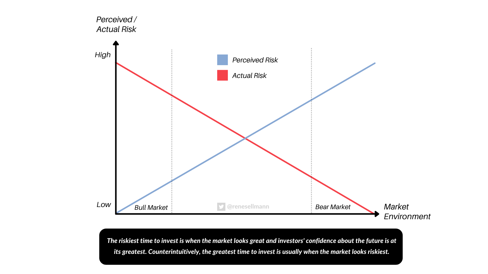
When perceived risk is low, stocks are often climbing without resistance. Companies are reporting upbeat numbers, the financial media is celebrating winners, and the narrative is that nothing can go wrong. Yet under the surface, that’s when actual risk is often peaking. The line between confidence and complacency blurs, and investors – whether consciously or not – begin to stretch their assumptions about what can go wrong – and they tend to bid up prices of equities to levels that rarely produce good outcomes.
Acting countercyclically in these moments feels almost unnatural. It’s hard. It goes against your human nature (to stay with the crowd). It requires you to sell when everyone else is chasing higher highs, to slow down when the crowd is accelerating. It’s difficult, uncomfortable, and often lonely. But it’s also one of the most important habits to develop if you want to consistently beat the market over decades.
That brings me to the first signal – one that’s flashing red right now.
Before we dive back in, a quick note…
Want to compound your knowledge – and your wealth? Compound with René is for investors who think in decades, not headlines. If you’ve found value here, subscribing is the best way to stay in the loop, sharpen your thinking, avoid costly mistakes, and build long-term success – and to show that this kind of long-term, no-hype investing content is valuable.
Signal #1 – Valuations & the Vanishing Equity Risk Premium
If there’s one thing that deserves top billing in this list of signals, it’s valuations. And right now, they’re not screaming “cheap.” They’re doing the opposite. We’re back in territory where stocks are priced for near perfection, and the margin of safety – the cushion that allows you to be wrong and still come out fine – is paper-thin.
The first chart tells the story clearly. It compares the yield on equities – represented here by the CAPE yield (the inverse of the Shiller P/E) – with the yield on 20-year TIPS, a risk-free, inflation-protected instrument. The gap between the two can be considered the equity risk premium (ERP). In other words, it’s the extra return you earn for taking on the added uncertainty of owning stocks instead of guaranteed bonds.
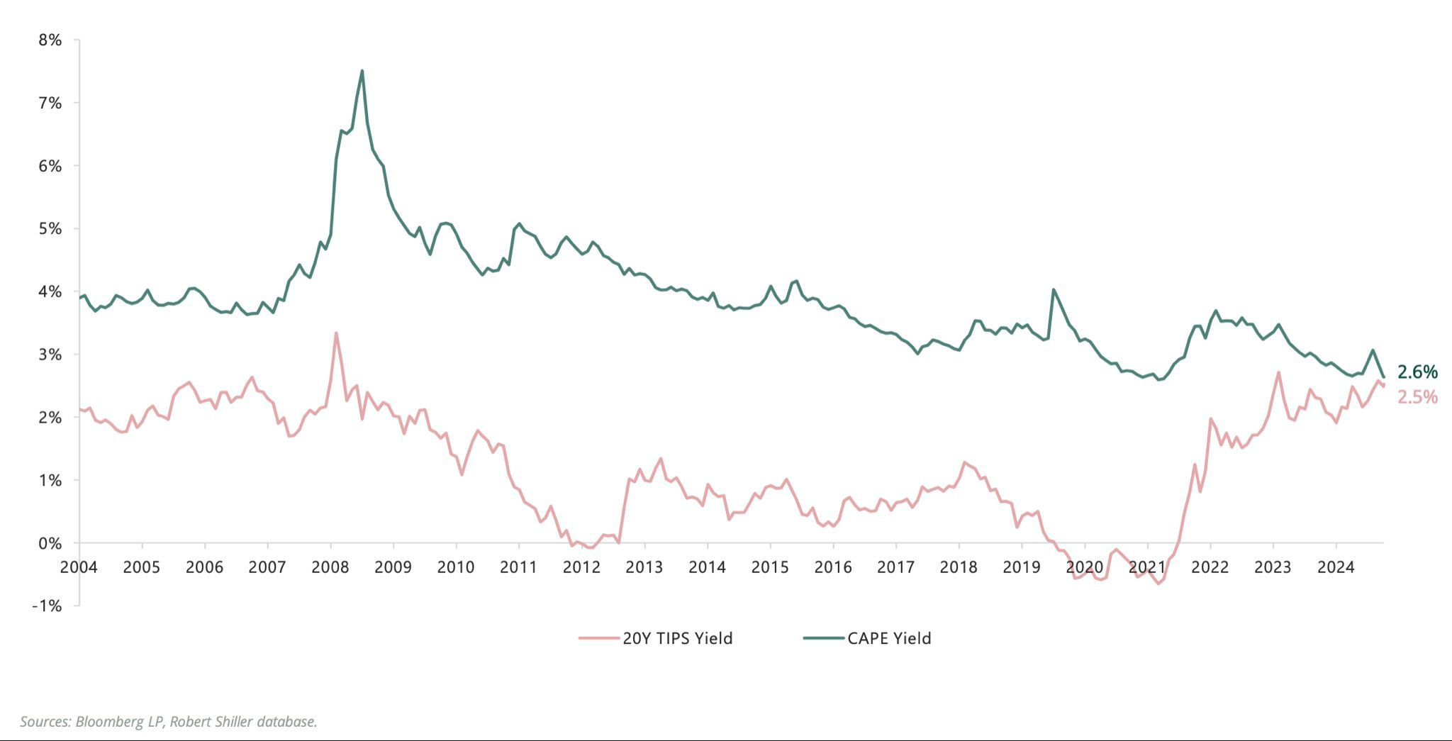
Over the past two decades, that spread has swung widely. After the Global Financial Crisis, ERP was historically generous – stocks were cheap, yields were high, and investors were too scared to take advantage. In 2011, the CAPE yield was more than double the 20-year TIPS yield. Today? That gap is essentially gone. At around 0.1 percentage points, the equity risk premium is at its narrowest in the entire 20-year sample!
Apparently, during the dot-com bubble, the two lines actually inverted – risk-free bonds yielded more than stocks. We’re not quite there yet, but the direction is clear.
What does that mean in practice? If you own the market today, you’re taking on all the volatility, drawdown risk, and earnings uncertainty of equities… for barely any more return than you could lock in from a government bond (depending on the underlying earnings growth, of course). And if the ERP history teaches anything, it’s that low or negative premiums have rarely been the start of a great buying opportunity.
The second chart adds another layer. It shows the share of MSCI World stocks trading at more than 10 times EV/sales – a level that, outside of speculative bubbles, is extreme. In the late 1990s, that share spiked to just over 20%, right before the dot-com bust. After years of relative calm, it’s climbed again in the past few years, spiking during the pandemic liquidity boom, dipping briefly, and now rising again toward those late-90s heights. The sectors driving this are predictable: technology and related growth industries, the very same areas where narratives can outpace fundamentals for far longer than skeptics expect.
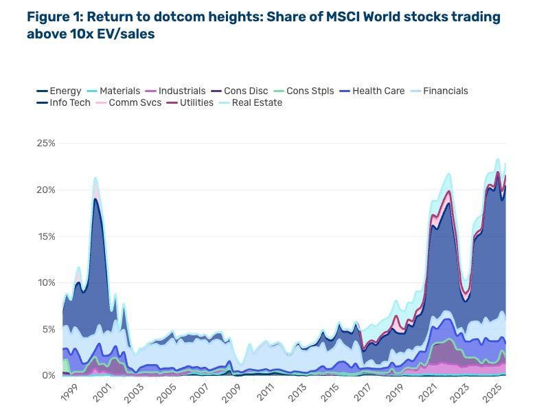
Put these two valuation perspectives together – the evaporating ERP and the high prevalence of richly priced growth stocks – and you get a market that’s priced for optimism. That doesn’t guarantee an imminent collapse. Valuations are blunt timing tools; expensive markets can get even more expensive. But it does mean that your forward expected returns, over the next five to ten years, are lower than average. And when the reward side of the equation is low, the relative value of cash – your dry powder – rises.
Signal #2 – Market Breadth: When Fewer Soldiers Are Carrying the Flag
Healthy bull markets aren’t just about the headline index numbers. They’re about participation. The strongest, most sustainable rallies are broad-based – many sectors, many stocks, all pulling in the same direction.
Conversely, narrow rallies, where gains are driven by just a handful of names, tend to be fragile. They can persist for a while, sometimes longer than skeptics think, but history suggests they rarely end well.
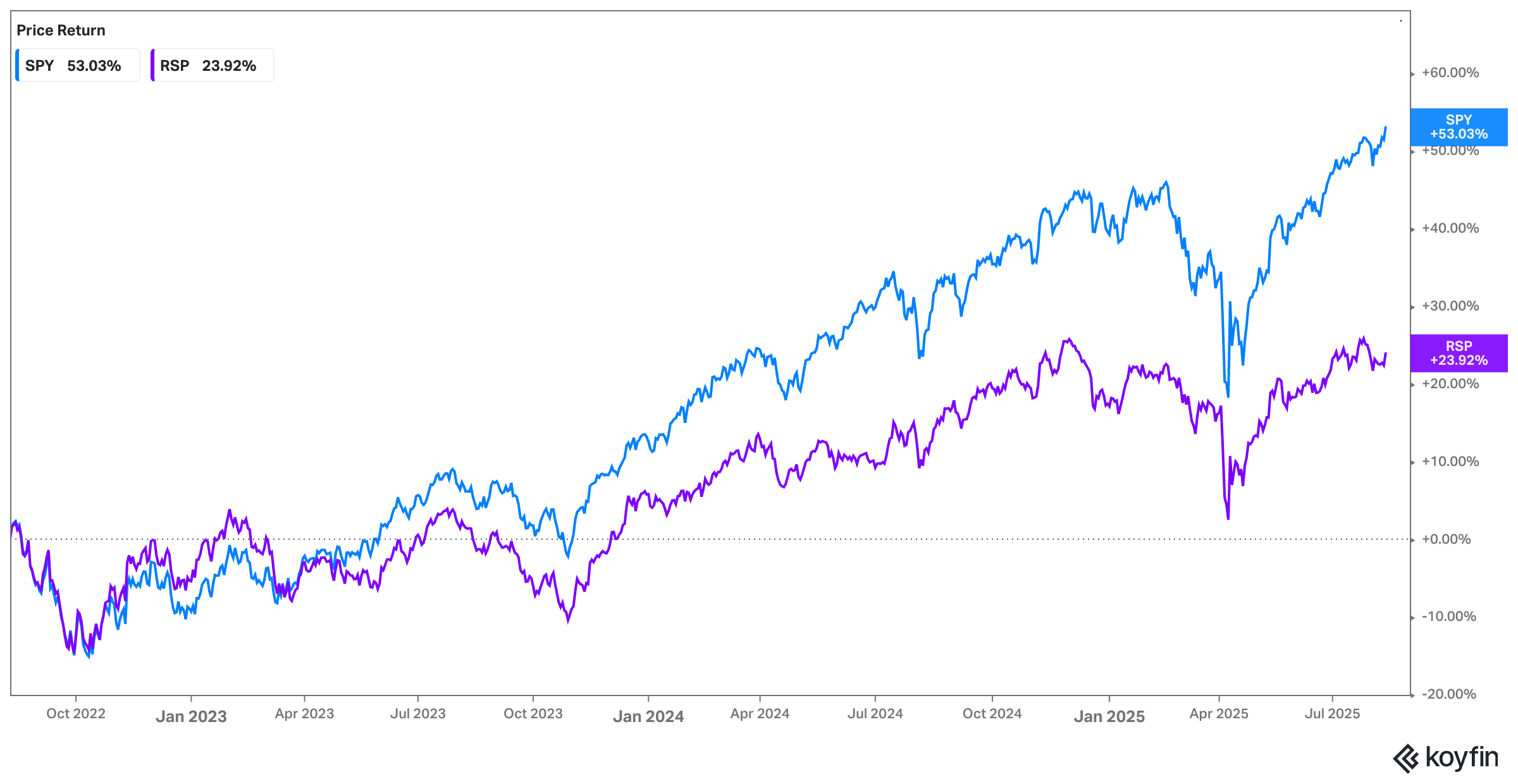
Right now, the market’s breadth looks… thin. If you compare the S&P 500 (market-cap weighted) to its equal-weight counterpart, you see a striking divergence. In April of this year, the two were running neck and neck – up 17% versus 20% since mid to late 2022. That suggested most stocks were keeping pace with the mega-caps.
But fast forward just a few months and the gap has exploded: the equal-weight index has underperformed by nearly 29 percentage points since April this year! The S&P’s recent highs have been pulled almost entirely by its largest constituents.
The picture gets starker when you look at other breadth measures. The “new highs minus new lows” line (to be found in the bottom half in the chart below) – the daily net number of stocks making 52-week highs versus those making 52-week lows – is a little underwhelming given that the S&P itself is at an all-time high. If this were a truly roaring, across-the-board bull market, you’d expect that line to be surging, like in 2017 or 2021. Instead, it’s muted.
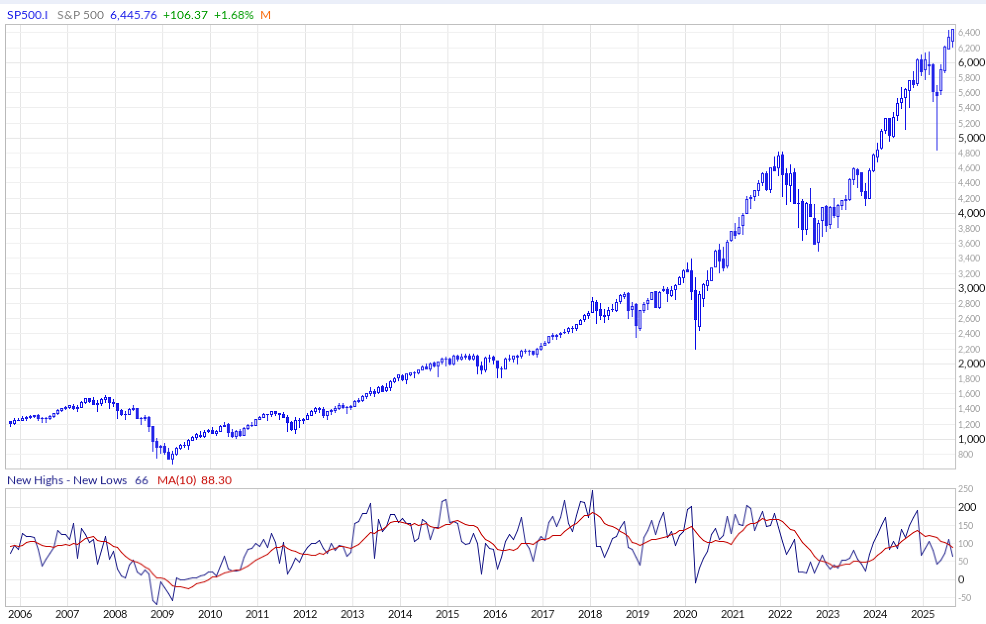
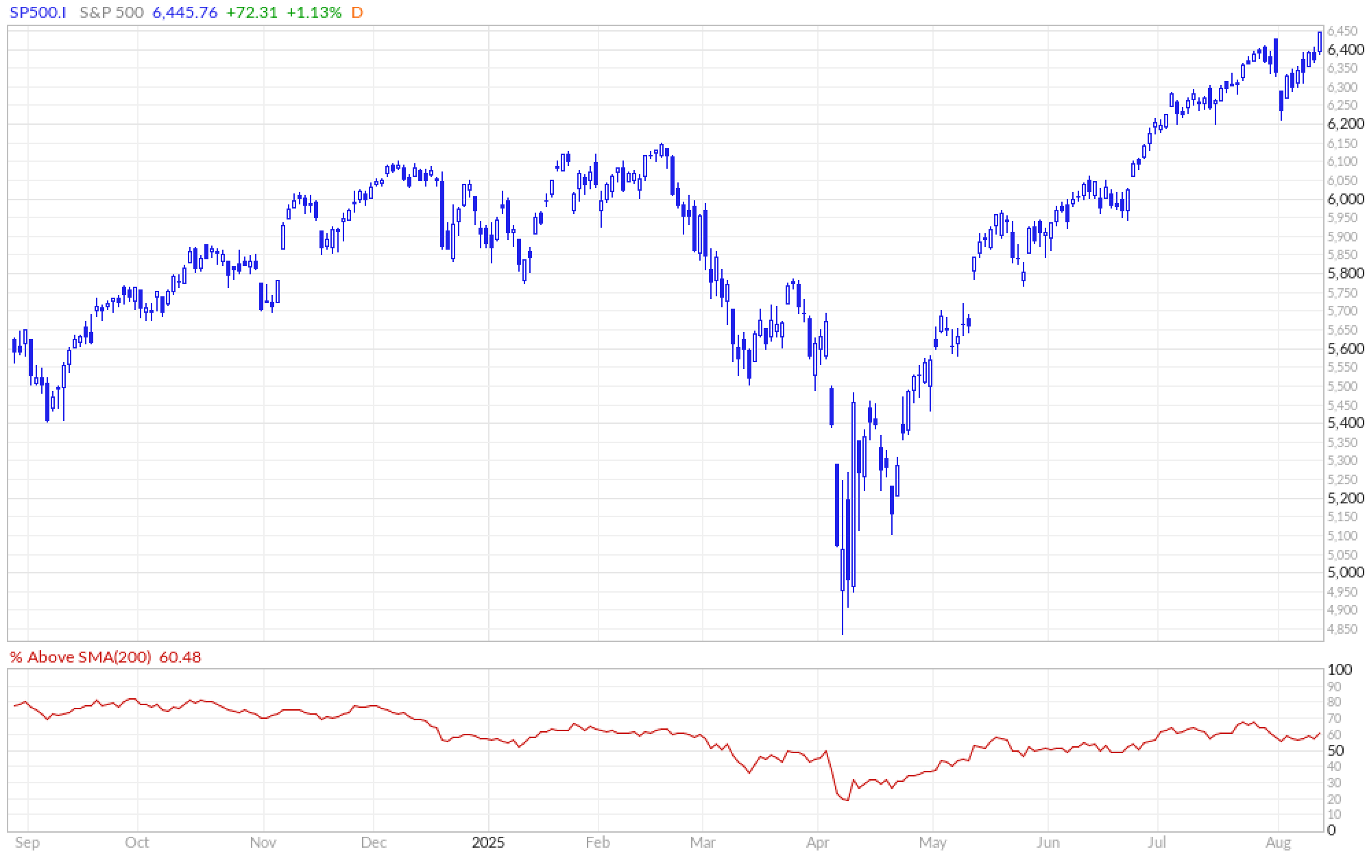
Then there’s the percentage of S&P 500 stocks trading above their 200-day moving average – a long-term trend measure. We’re sitting at around 60%. That’s not bad, but it’s far from an “all-in” number. In past healthy uptrends, that figure has often pushed toward 80–90%. The fact that 40% of the index is still below its long-term trend while the headline index sets records suggests a market with some serious internal weakness.
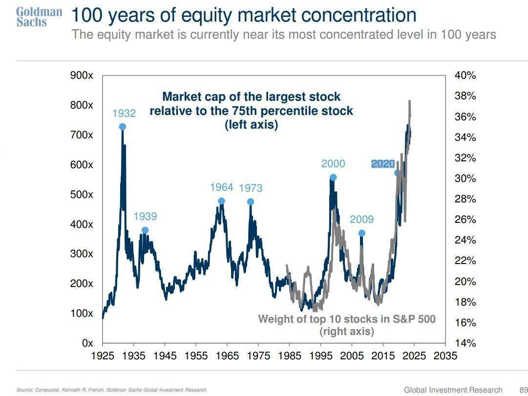
Finally, we can’t ignore concentration. The weight of the top 10 stocks in the S&P 500 is hovering near record highs – levels we haven’t seen in a century. Goldman Sachs’ historical analysis shows that extreme concentration tends to cluster around market inflection points: 1929, the late 1960s, the dot-com peak, and now. High concentration by itself isn’t a sell signal – dominant companies can remain dominant (for some time) – but it does mean the market’s fortunes are disproportionately tied to the performance of a few giants. When leadership narrows to this degree, any stumble from those leaders can cause outsized damage to the index.
Breadth isn’t just an academic metric. It’s a measure of the market’s structural health. And right now, the patient is standing, but a lot of muscles aren’t firing.
Before we dive back in: Become a paying subscriber to get access to all of my other research, including valuation spreadsheets, deep dives (e.g. LVMH, Edenred, Digital Ocean, or Ashtead Technologies), and powerful investing frameworks.
Thank you for your support!
PS: Using the app on iOS? Apple doesn’t allow in-app subscriptions without a big fee. To keep things fair and pay a lower subscription price, I recommend just heading to the site in your browser (desktop or mobile) to subscribe.
Signal #3 – Speculative Assets at Highs
One of the more subtle – but powerful – signals of where we are in the market cycle comes from looking at the most speculative corners of the investment universe. These are the assets that thrive when liquidity is abundant, investor confidence is high, and risk appetite is overflowing. They’re the first to run when the punchbowl is full… and often the first to get crushed when it’s taken away.
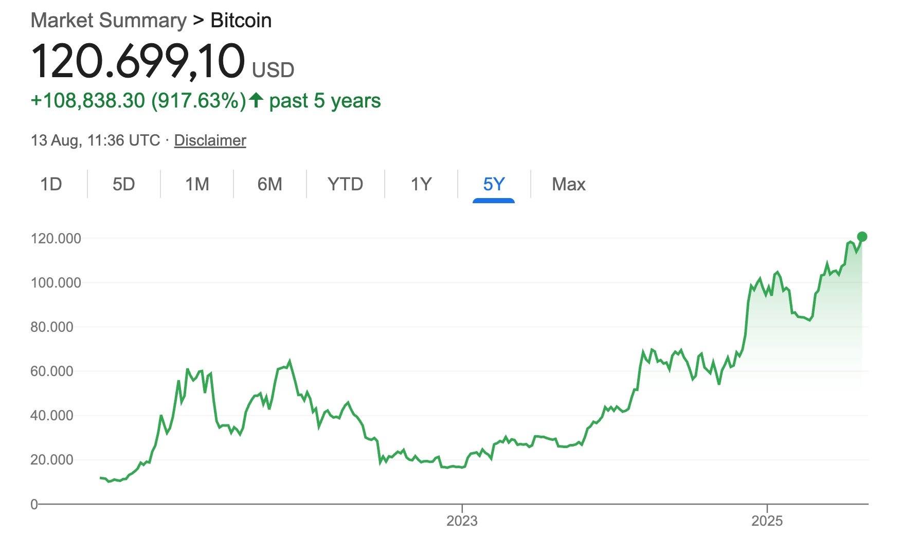
Right now, Bitcoin is hovering at all-time highs. On the surface, that might seem disconnected from equities – after all, crypto has its own ecosystem, its own narratives. But in practice, Bitcoin tends to behave like a high-beta, sentiment-driven asset. It thrives in periods of easy money, loose financial conditions, and investor euphoria. Over the past decade, sharp run-ups in Bitcoin prices have often coincided with late-cycle phases in equities, when risk tolerance is peaking.
It’s not just Bitcoin. During other euphoric market phases, we’ve seen this speculative fever spread to whatever the “shiny new thing” happens to be – from dot-com stocks in 1999 to housing in 2006 to NFTs and meme stocks in 2021. These assets share a common pattern: their valuations detach from underlying fundamentals, trading becomes narrative-driven, and the crowd piles in because the price is going up, not because the intrinsic value justifies it.
Why does this matter for a discussion about raising cash? Because speculative surges in fringe assets are often a byproduct of the same conditions that push broader markets to unsustainable heights: excessive liquidity, compressed risk premiums, and investor overconfidence. In the same way a fever tells you the body is fighting an infection, a speculative mania tells you the market is in an advanced stage of optimism.
Academic research supports this link. Studies on “cross-asset spillovers” show that when speculative assets like crypto, collectibles, or ultra-high-growth startups hit extremes, correlations with riskier parts of the equity market tend to rise. Investors treating gains in one area as “house money” often recycle that capital into other risky bets, further inflating valuations elsewhere.
The point isn’t that Bitcoin making new highs will cause stocks to fall. It’s that such highs are symptomatic of a market environment where capital is cheap, risk-taking is fashionable, and fear is scarce. It’s another signal.
Signal #4 – Value Underperformance: A Market Preferring Story Over Substance
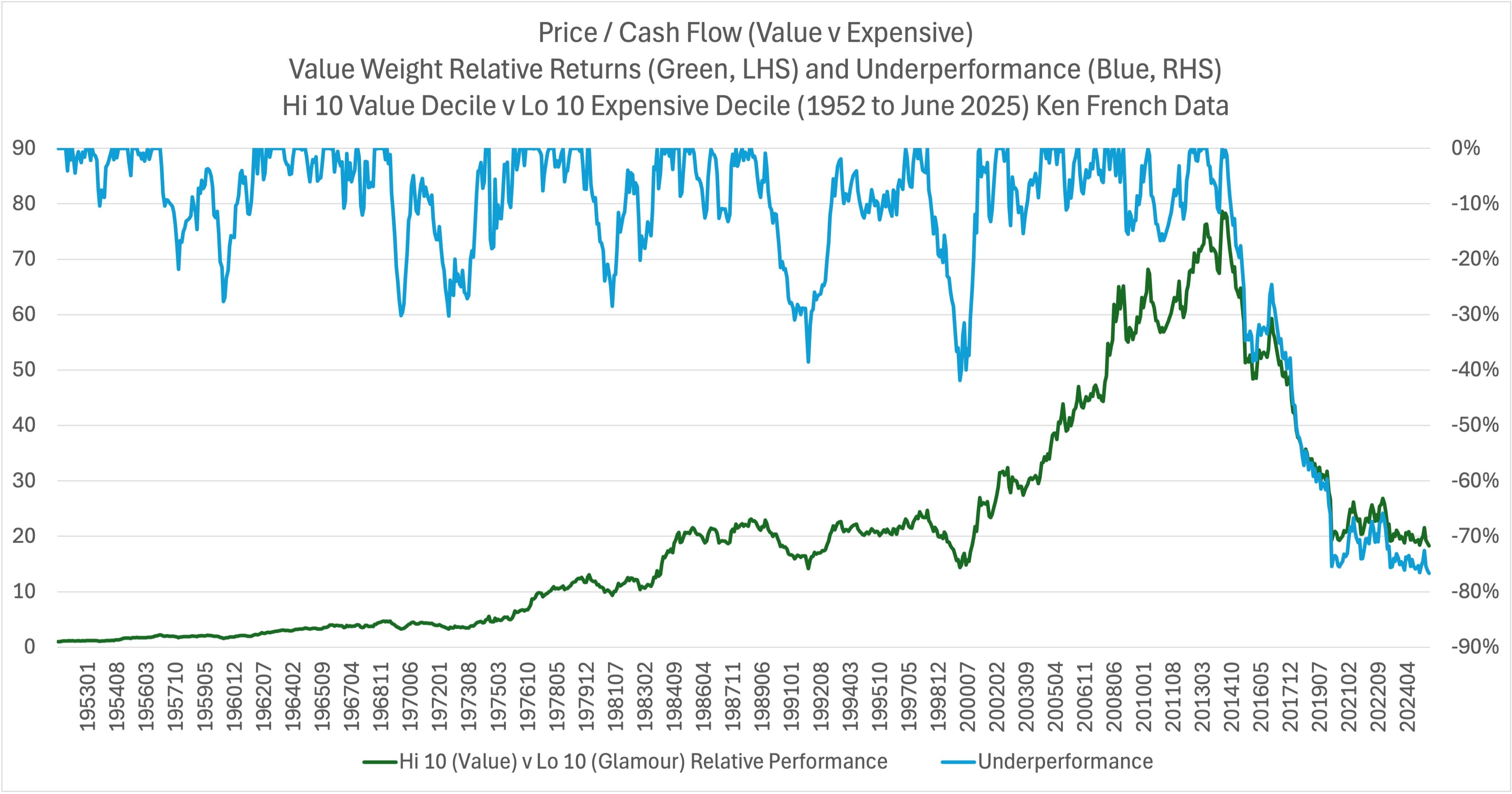
Another signal that caught my attention is the staggering underperformance of value stocks relative to expensive “glamour” names. Tobias Carlisle recently shared the data: since 1952, the cheapest decile of stocks on a price-to-cash-flow basis has outperformed the most expensive decile by roughly 18x. That’s not a typo. Over the very long term, paying less for a dollar of cash flow has been a winning strategy, and by a wide margin.
But since June 2014, the story has flipped – and flipped hard. Value has underperformed expensive stocks by about 77%. You can see it clearly in the chart: the green line representing value’s relative performance trends upward over decades, interrupted only by temporary reversals. Then, around 2014, it breaks decisively lower, plunging to underperformance levels we haven’t seen in modern market history.
Why does this matter for our discussion about raising cash? Because prolonged value underperformance is often symptomatic of a market that’s placing a very high premium on growth narratives, momentum, and future potential, rather than on current fundamentals. Investors are paying up – sometimes massively – for companies whose cash flows may lie far in the future. That can work beautifully in environments with low interest rates, abundant liquidity, and optimism about technological change. But it also leaves little room for error.
We’ve seen this before. The late 1990s were another extreme stretch where expensive growth crushed value. The mood back then was that “old economy” companies were obsolete; all the real returns would come from the “new economy.” For a while, that belief was self-reinforcing – expensive got more expensive, and valuation discipline looked quaint. But when the dot-com bubble burst, the pendulum swung hard back toward value.
Signal #5 – Hedge Fund Cash Levels: When Pros Are All-In
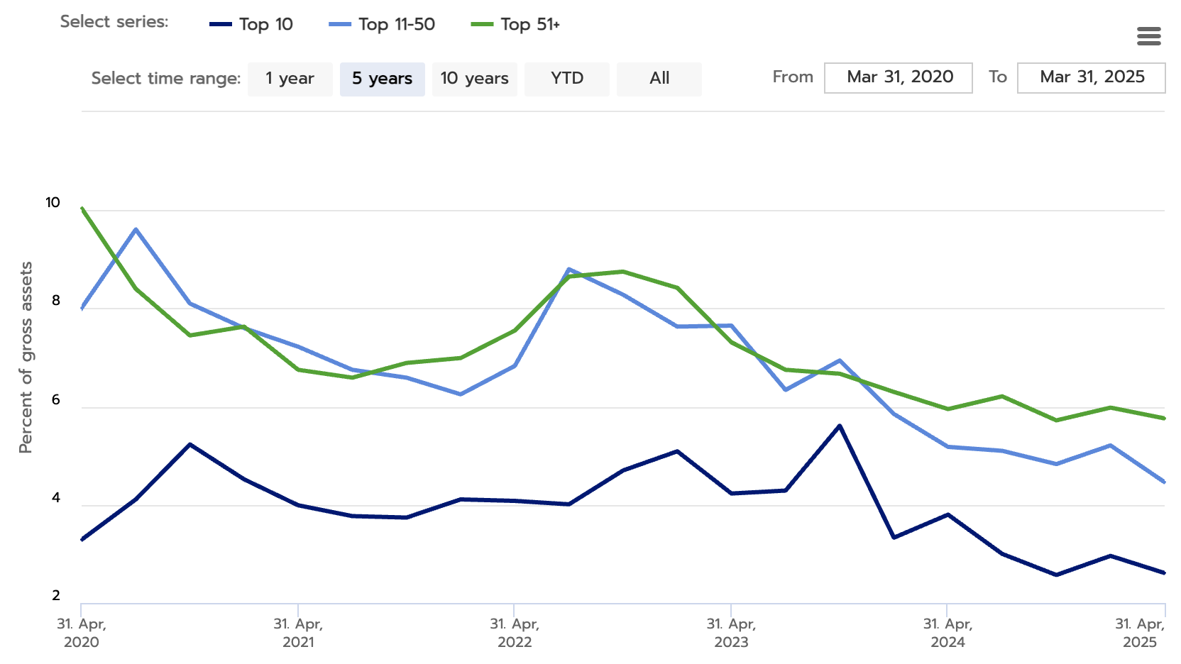
One of the more telling positioning indicators comes from hedge fund cash levels. The chart here tracks the unencumbered cash ratio – cash as a percentage of gross assets – for funds across different size cohorts. As of the latest data, cash levels for the top 10, top 11–50, and top 51+ funds are all near five-year lows. For the largest funds, cash is hovering around 2–3%. That’s about as close to “fully invested” as you get in professional money management.
Low cash levels can mean a few different things. In one light, it signals confidence. These managers see opportunity and want to maximize exposure. But in a contrarian framework, low cash is a yellow flag. It means there’s very little dry powder left to buy dips. If markets turn lower, instead of stepping in as liquidity providers, these same funds may become forced sellers to meet redemptions or rebalance exposures.
There’s also the behavioral angle. Hedge funds are in the business of generating returns and justifying fees. When markets are trending higher and clients are seeing double-digit gains from passive ETFs, the pressure to stay fully invested mounts. Nobody wants to be the manager who underperformed – albeit temporarily – because they held too much cash while the S&P ripped higher. That career risk can push managers to chase the tape, even when valuations are stretched and signals are flashing caution.
History shows that extreme positioning – whether in hedge funds, retail (more on this below), or mutual funds – often coincides with market inflection points.
To be clear, hedge fund positioning is not a perfect timing tool. Managers can remain fully invested through prolonged rallies. But as a part of the broader mosaic of signals, low cash levels fit the picture of a market where risk-taking is widespread, and defensive positioning is scarce. When combined with rich valuations, narrow breadth, speculative fervor, and value underperformance, it strengthens the case that we’re late in the cycle.
And we’re not done yet…
Signal #6 – Retail Equity Exposure: When Everyone’s Already In
One of the cleaner contrarian signals comes from looking at how much of their wealth households have allocated to equities. The FRED data on “Households and Nonprofit Organizations; Directly and Indirectly Held Corporate Equities as a Percentage of Financial Assets” is one indicator to consider. Today, that number is at its highest level on record – higher than during the dot-com bubble, higher than before the 2008 financial crisis.
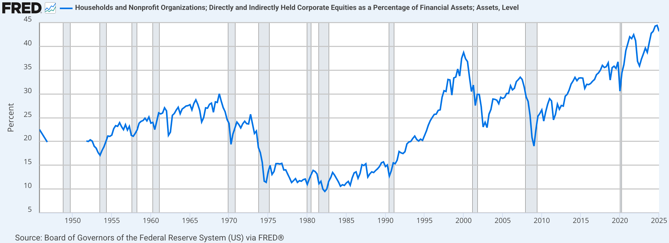
Why is that important? Because equity ownership levels and future returns have historically had a negative correlation. When a large share of households’ financial assets are already in stocks, it means there’s less incremental buying power left. Everyone who’s inclined to be bullish is already positioned that way. The marginal buyer – the one who pushes prices higher – becomes harder to find.
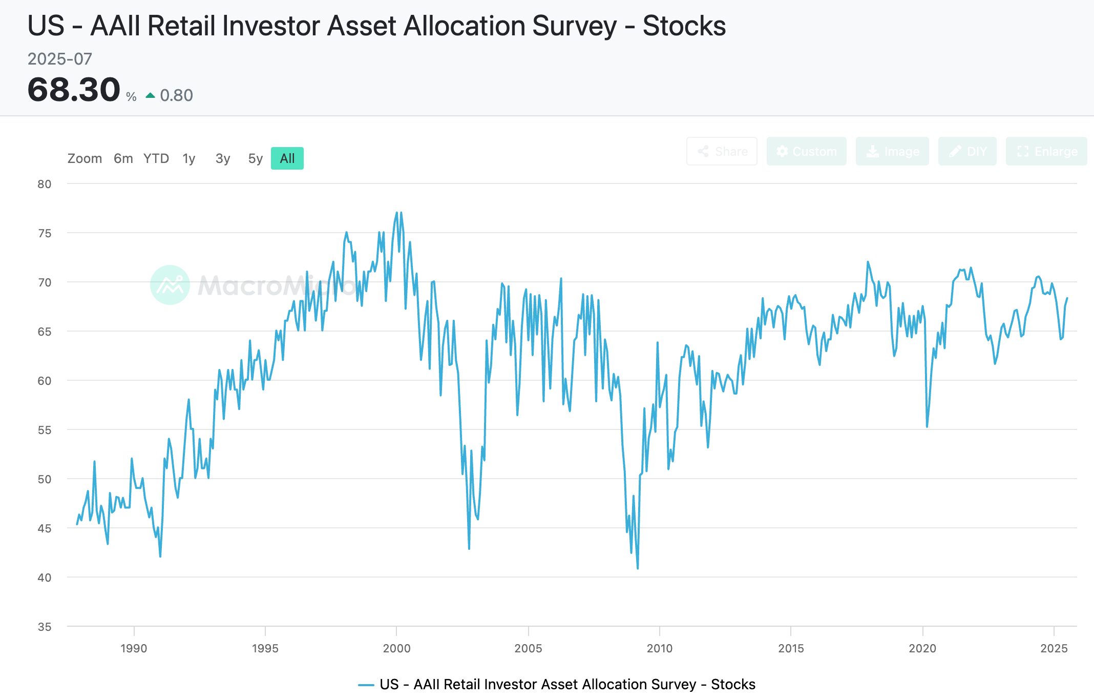
The AAII Retail Investor Asset Allocation Survey paints a similar picture. Retail stock exposure is sitting near multi-decade highs, in the upper 60% range. That’s not the kind of number you see at market bottoms, when panic pushes equity allocations into the 40s. It’s the kind of number you see when optimism is entrenched.
And then there’s the anecdotal evidence – the kind of thing you don’t see in the data tables, but you feel in the market’s mood. How “back” are we? We’re so back that ARK Innovation ETF ($ARKK) just took in $800 million in a single day – its largest one-day inflow ever.
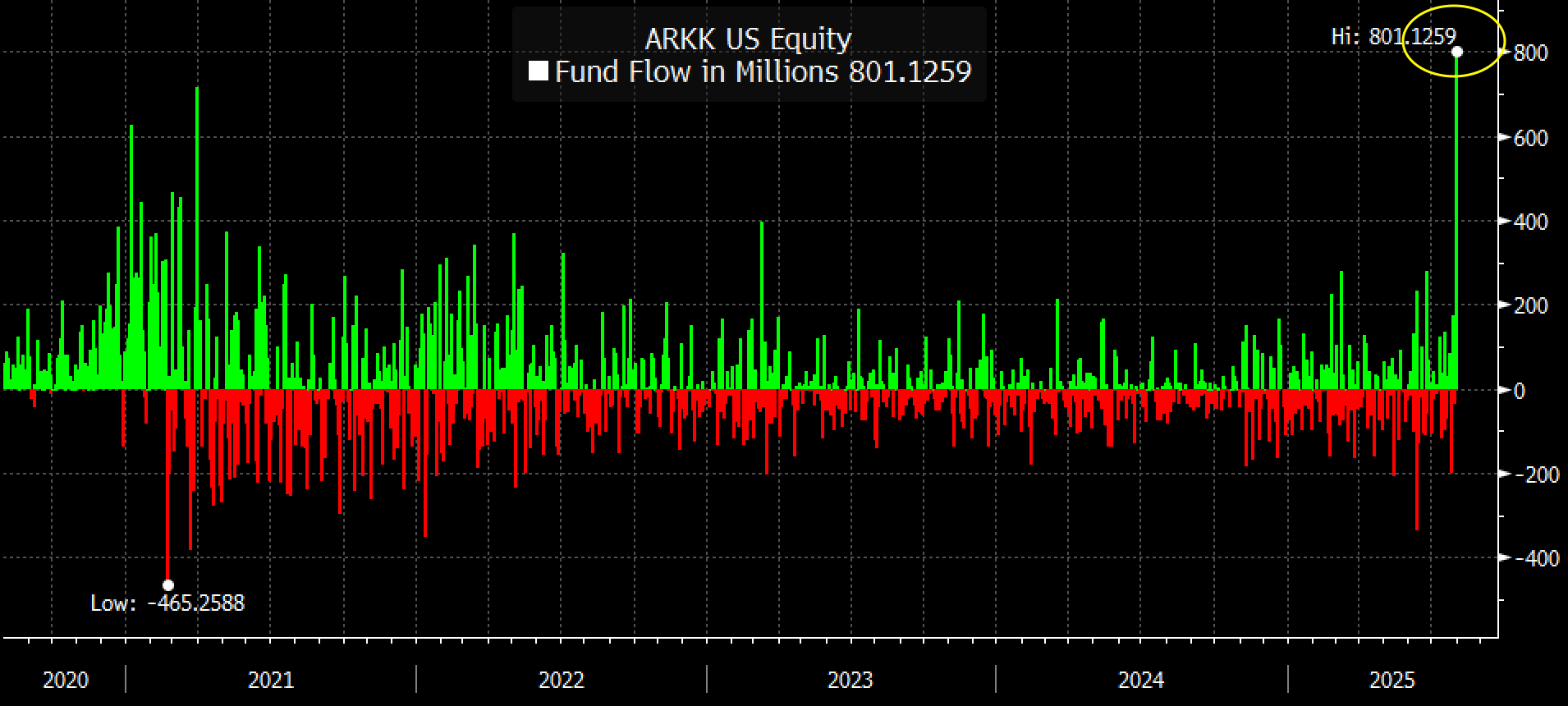
When speculative thematic funds start drawing this kind of money AGAIN, it’s a sign that risk appetite isn’t just healthy – it’s ravenous.
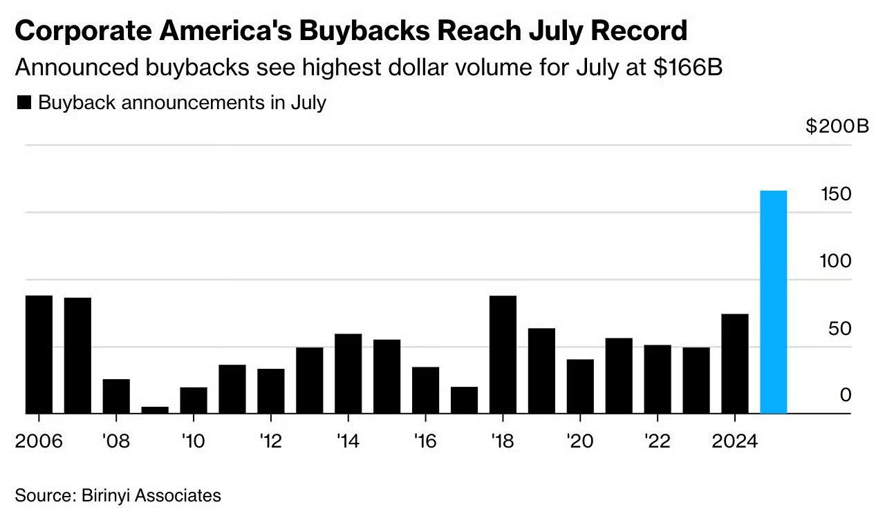
Signal #7 – Corporate Buybacks and the IPO Window
Corporate buybacks are back in force. Historically, these programs tend to peak when management confidence is high, balance sheets are flush, and valuations are elevated – precisely the moment when forward expected returns are least compelling. At market bottoms, when buybacks would actually deliver the best bang for the buck, they almost disappear as companies pull back to conserve cash. In that sense, buybacks often function as a contra-indicator: they tell us more about sentiment than about disciplined capital allocation.
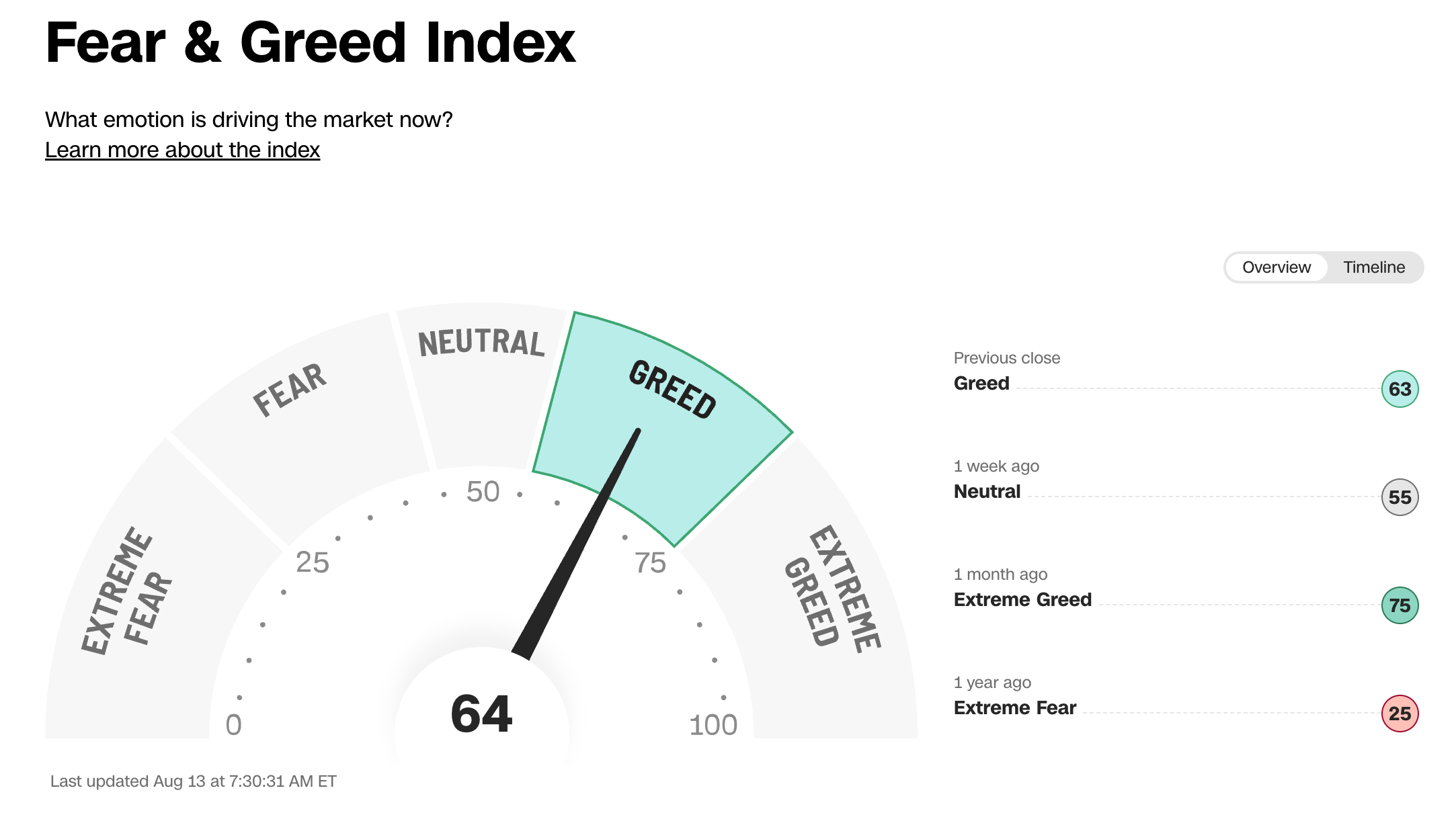
Signal #8 – CNN Greed and Fear Index
The CNN Greed & Fear Index – which blends seven market sentiment measures like option activity, market breadth, and safe-haven demand – is currently signaling “greed.” I wouldn’t overstate its predictive power; it’s more of a temperature check than a timing tool. That said, it’s one more indicator leaning toward optimism, adding to the picture of an investor base that’s far from cautious.
Signal #9 – The AI CapEx Boom: Late-cycle tell or durable supercycle?
The ninth light on my dashboard is the AI capital-spending wave. It’s massive. The Morgan Stanley breakdown you see in the first chart estimates roughly $2.9 trillion of global data-center capex through 2028 (excluding power).
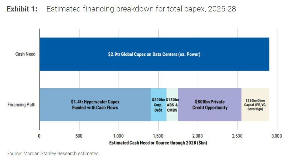
About $1.4 trillion is expected to be funded out of hyperscaler cash flows, but the rest leans on balance sheets and markets – roughly $200 billion of corporate debt, $150 billion via ABS/CMBS, an $800 billion private-credit opportunity, plus another $350 billion from PE/VC/sovereign sources. Translation: we’re not just talking about healthy reinvestment from profits; we’re talking about a financing machine pulling in every form of capital it can find.
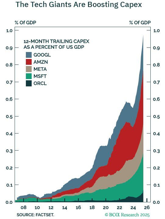
The second chart brings the scale home from a different angle. Capex at the big platforms – Alphabet, Amazon, Meta, Microsoft, Oracle – has surged toward ~1% of U.S. GDP on a trailing-twelve-month basis. That’s extraordinary. Tech’s build-out has become macro-relevant in its own right. When an industry’s capex approaches macro scale, it can become a cyclical driver of both earnings and markets.
Here’s why this sets off my “top-ish” radar. Capex cycles tend to overshoot. Railroads in the late 1800s, telephone and cable build-outs in the 1990s, shale in the mid-2010s – the pattern is familiar. A real opportunity appears, early returns look phenomenal, capital floods in, suppliers scale, financing gets easy, marginal returns slide, and the leaders eventually dial back spend. Equity markets usually anticipate the turn well before management teams officially change guidance. I’m not predicting a bust in AI – far from it – but I respect how often peak investment intensity lines up with peak optimism and diminishing incremental returns.
Second, the financing mix matters. When internal cash flows fund the majority of a build, discipline is usually tighter. When outside capital fills the gap at scale – private credit, securitizations, supplier financing – the system can become more tolerant of lower hurdle rates. It’s subtle. Each participant is rational in isolation. Aggregated, it lowers the market’s overall cost of capital for the theme and encourages one more year of “must build.” That’s how you get overcapacity in compute, networking, and real estate even if the aggregate TAM ultimately proves huge.
How do I reconcile all that with the obvious counterpoint – that AI may be a genuine, decades-long productivity driver? I hold both thoughts. On a 10- to 20-year view, I’m optimistic about AI’s impact on profits and unit economics across many industries. On a 12- to 36-month view, the outside-view lesson is that capex super-cycles usually travel with rich valuations, rising concentration, and plentiful financing. We have all three. That’s why, as an investor, I treat the AI capex boom as a late-cycle feature even if the technology megatrend endures.
The Case Against Panic: What’s NOT Pointing to a Top
If there’s one lesson markets teach over and over, it’s that you want broad confirmation before making big portfolio moves. A single indicator flashing red can be more noise than signal, and even a cluster of warnings doesn’t guarantee we’ve hit “the” top. Market peaks tend to be messy processes rather than single-day events, and they often involve widespread froth across many fronts – not just a few hot readings.
Market tops also follow different patterns: Sometimes, major bull markets end with an explosive blow-off top (think of the dot-com bubble) – and sometimes they don’t. In 1929 and 1999, the frenzy of euphoria was off the charts, with stock markets turning into full-blown casinos.
Other times, however, trends simply lose steam and fade gradually, the bull market “rolls over” as in 1969, when Buffett famously recognized the peak and shut down his partnership. To me the current market setup feels more like the latter.
It’s important to always also consider what’s not lining up with the “time to raise cash” thesis.
Take the IPO market. If we were truly in a euphoric, late-cycle blow-off, we’d expect to see the kind of frenzy we saw in 2021 – hundreds of companies rushing to list, valuations pushed into the stratosphere, and deal sizes breaking records. That’s not the case today. Yes, activity has picked up from the 2022–2023 trough, but it’s still nowhere near the mania levels that tend to precede major tops. We’re in a recovery still below 2017-2019 levels, not a stampede.
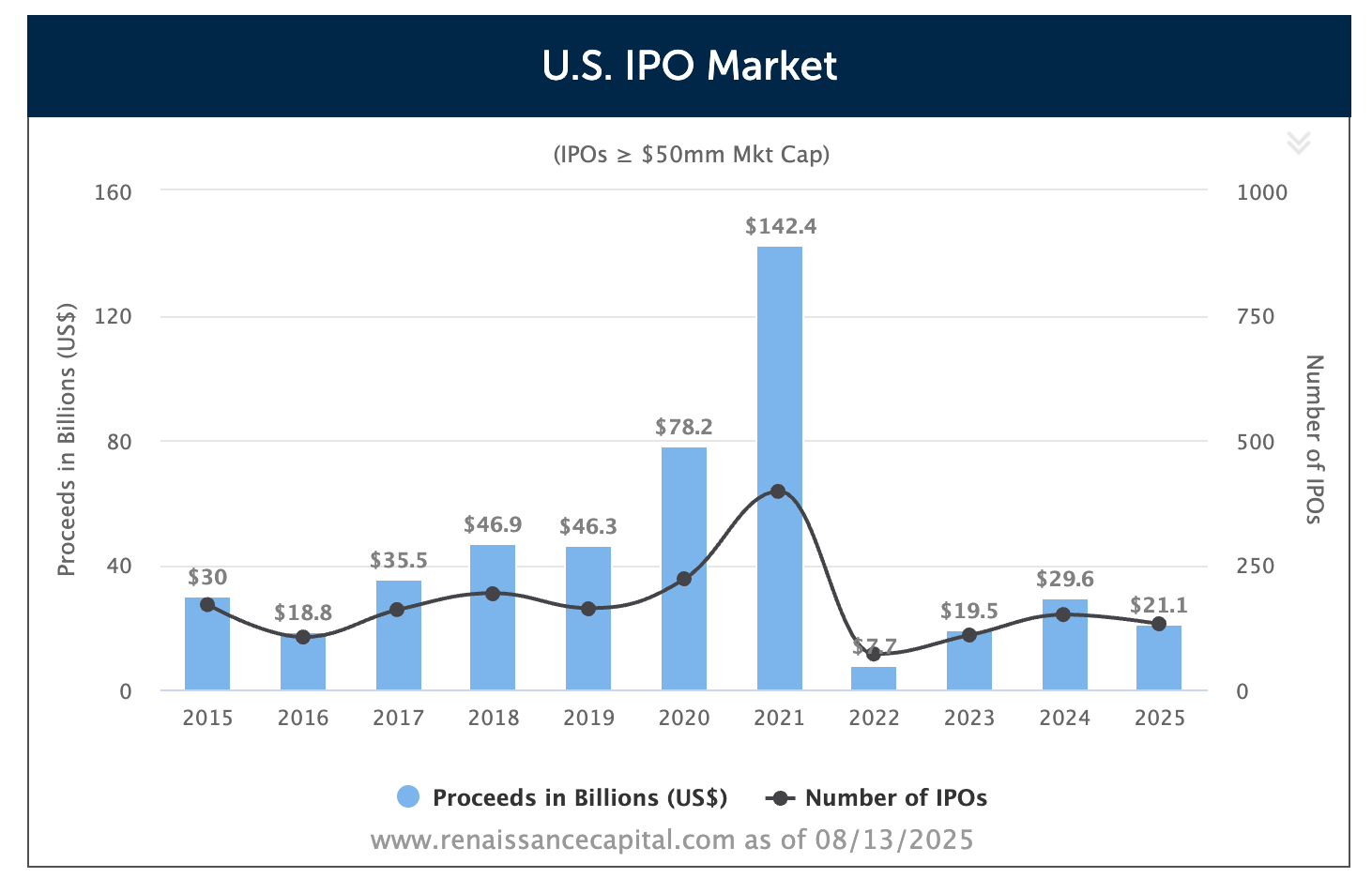
That difference matters. An IPO boom is often a sign that insiders – those with the best knowledge of their businesses – are eager to cash out while the market is in a buying mood. When that appetite isn’t there, it suggests that at least part of the investor base is still somewhat cautious.
🎉 Join the private WhatsApp community!
Discuss stock ideas, ask questions, and get behind-the-scenes thoughts in real-time.
Available exclusively for paid subscribers. Want in? Choose the annual subscription plan + reply with your number (more details in the welcome email).PS: Using the app on iOS? Apple doesn’t allow in-app subscriptions without a big fee. To keep things fair and pay a lower subscription price, I recommend just heading to the site in your browser (desktop or mobile) to subscribe.
Concluding Thoughts
If timing market bottoms is hard – and it is – then timing tops is even harder.
There’s no bell that rings at the peak, no flashing red light that says “this is it, time to get out, thanks for playing.”
At best, you can stack up enough warning signs to tilt the odds in your favor. But even then, expecting to nail the exact turning point is unrealistic. My preference has always been to err on the side of being a little early rather than too late. Being too early might cost you a bit of upside (and a lot of nerves); but being too late can cost you a lot more.
The challenge is that there are no completely reliable, single-shot signals of a market top. That’s because as discussed tops are rarely a one-day event – they’re a process. Conditions tighten, sentiment shifts, and liquidity starts to dry up, all in slow motion. Breadth often rolls over before the indexes do. Insider selling ramps up. Retail and institutional cash levels shrink, the VIX sinks to complacent lows, and credit spreads tighten to unsustainably narrow levels. There’s usually a euphoric narrative or hot fad dominating headlines – AI fits that bill today. Short-biased funds start shutting their doors, social media feeds overflow with hubris, people brag about returns, and M&A and buybacks push toward records.
Right now, we have nearly all of those elements in play. That’s enough to make me cautious.
After trimming DigitalOcean, I’m currently sitting on 15% cash, a level I feel comfortable with. To me, the market feels “top-ish” but not fully “bubbly” yet.
That’s a crucial distinction. It’s also why I’m not rushing to raise more cash at this point. Many of the stocks I own still look attractively priced (to me at least) relative to their long-term prospects, and the expected returns from these levels are, in my view, still compelling. Selling them just because the broader market feels stretched doesn’t make sense to me.
I do have a set of principles for raising cash more strategically – specifically, which positions to trim or exit first when the goal is to de-risk without hollowing out your best ideas. That’s a conversation I’ll save for a future post, because it deserves its own deep discussion.
For now, my takeaway is simple: the signs of froth are accumulating, but the case for an immediate, aggressive cash-raising move isn’t airtight. This is a time for balance – keeping some dry powder, staying selective, and letting the weight of the evidence, not just the loudest signal, guide your decisions.
A solid read with some well researched hard to refute data points René.
I've always managed $CASH as a position in my own portfolio, varying it to account for my internal barometer on valuations and overall market sentiment. I played 2022 fairly astutely, moving from 3% to 26% cash before the major sell-off in growth stocks, but there was a fair degree of luck in that timing, so I aim to be a little more cautious in my forecasting this time around.
Overall though, it feels like there are still several significant catalysts for continued growth yet to fully play out - Fed rate cuts, deregulation of AI, a friendly M&A environment, and a bunch of other smaller impacts for individual companies in my portfolio (e.g. Tesla FSD wide rollout).
I'm currently at 17% cash and in 'wealth accumulation' mode as I continue to gradually deploy this, mostly by trying to find sensibly valued opportunities in smallcap tech and in income-growth stocks. I have a short-term target of getting to 15% by the end of Q3, but am also trying to be fairly alert to a change in the market mood, recognising that this could very well strike before I can act. If I do elect to flip back into 'capital preservation' mode, I know exactly where I'm going to trim the portfolio so I can get back to 25%+ cash.
(The irony is not lost on me that I behave like I know how to time the market, while also recognising that this is impossible 🤷♂️)
Luke
What do you think of downside protection in times like these? Eg. Long put options sp500