

Dear compounders,
Today, I want to start with a small experiment.
Imagine this … you are only allowed to use one metric to judge whether the stock market is cheap, fair, or expensive. You get no macro data, no margin analysis, no sentiment surveys.
You pick one metric and have to live with it for the rest of your life.
The choice is between the Shiller PE (the cyclically adjusted P/E, or CAPE) and the regular P/E, on either a trailing or a forward basis.
Which one do you take?
Please stop reading here for a minute. Think it through, commit to an answer, maybe write your reasoning in the comments too before you read the rest of this post and before you look at what anyone else wrote.
Once you’ve seen my argument or someone else’s, your own thinking gets anchored, and the exercise loses most of its value. If you change your mind by the end, leave a second comment and tell me what moved you.

Done? Good. Let’s go.

How a Comment Thread Led to This Post
This question came out of an exchange on Substack Notes. A reader – JF – argued that bears reach for the Shiller PE because the regular P/E doesn’t support their crash narrative.
His case against CAPE was pointed and, to be fair, pretty intuitive. The Shiller PE divides today’s price by the average of the last ten years of inflation-adjusted earnings. The largest companies have grown their profits so much over that decade that the average is stale.
Ten years ago, Wells Fargo was among the ten largest US companies by market value. Why should 2016 earnings carry the same weight as 2025 earnings when you are assessing today’s market?
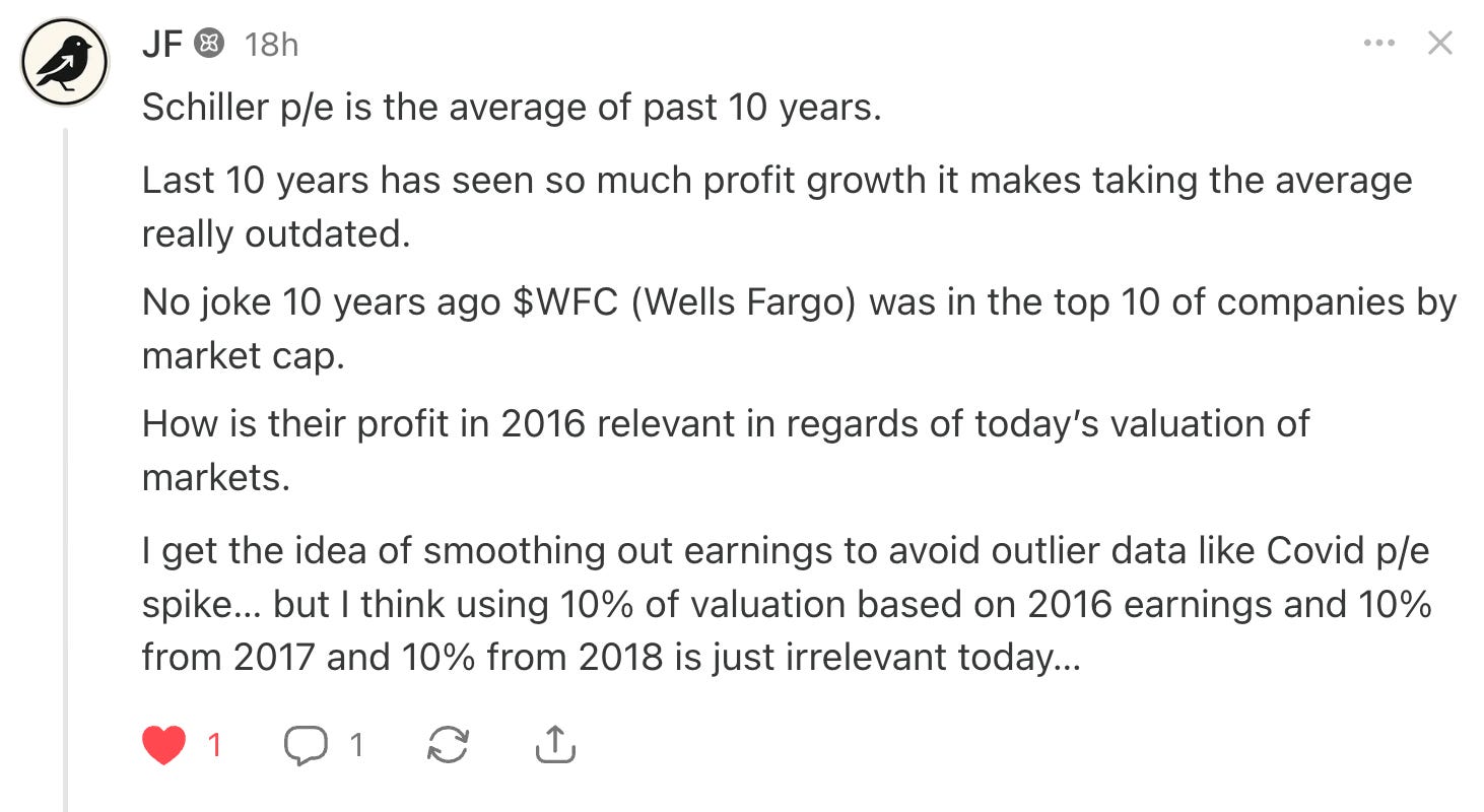
He added that today’s megacaps sell worldwide and scale in ways that were unthinkable in the 1930s or even the 1990s, so maybe CAPE becomes useful again once these businesses mature.

Those are all fair points.
Despite that, my answer to the theoretical question I posed in the opening of this post and that I superficially discussed with FJ in the Notes comment section was still …
“I’ll go with the Shiller!”
And it wasn’t a close call for me.
Today, I decided to take the question apart properly and give it some more thought.
First, the numbers. They explain why the debate gets heated. As of September 1, 2026, the CAPE ratio stood above 41x, the second-highest reading in more than 150 years of data, according to multpl.com.
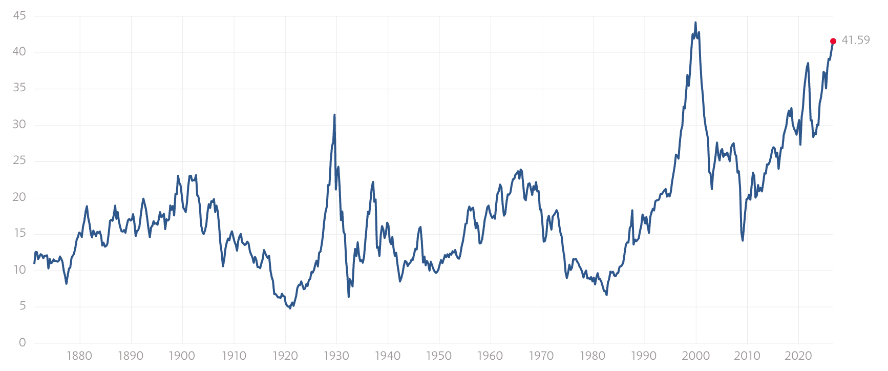
By one count, only 20 months since 1881 have been higher, all of them in 1999–2000 or 2026.
The regular P/E tells a much softer story. Multpl puts the trailing 12-month P/E at 26x, above both its 5-year average of 24.4x, its 10-year average of about 23-24x, and its long-term average of about 16x …
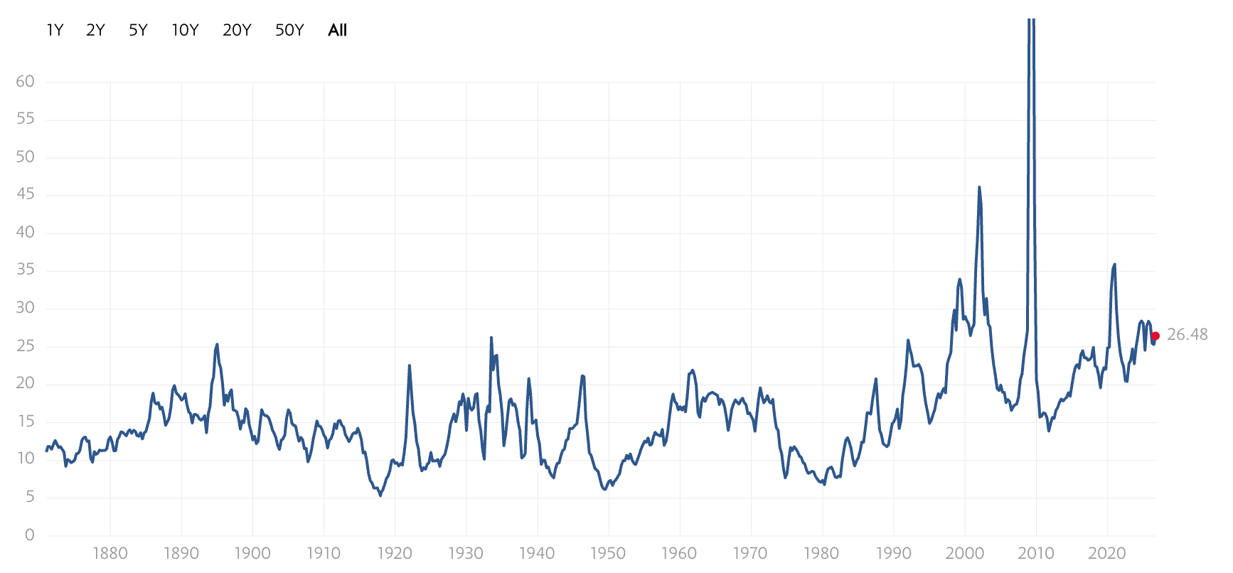
FactSet puts the forward 12-month P/E at 19.1, slightly below its 5-year average of 19.8 and roughly in line with its 10-year average of 19.0.
So, depending on which number you use, the market is either at dot-com levels or roughly at its ten-year norm.
That gap is massive and is what prompted the whole debate in this post.
Welcome to Compound with René. You can find an overview of the companies I shared a deep dive on in the visualization below.

If you haven’t subscribed, you can join 5,000 readers who enjoy the quality of the deep dives, the process-oriented pieces, the analytical insight, and the valuation discipline, here:
My Three Lenses for Good Decision-Making
When I try to think clearly about a hard question, I test it against three cornerstones:
common sense,
empirical evidence, and
theory.
Each one on its own is dangerous. Common sense without evidence produces confident stories. Evidence without theory produces data mining, and you end up finding patterns that don’t mean anything. Theory without common sense produces elegant models that fall apart the first time they meet with the real world. As one of my favorite sayings goes, “in theory, theory and practice are the same. in practice they are not.“
Good thinking tends to happen where the three overlap, so that is how I’ll structure the rest of this post.

Common Sense Test
Start with the common sense test. A P/E ratio is a price divided by a single year of profits.
Anyone who has ever owned a cyclical stock knows what that implies: the denominator can be badly misleading at exactly the moments when judgment matters most. I wrote a blog post titled “The 10 Hidden Dangers of the PE Ratio: The Definitive Guide to Wall Street’s Most Overused Metric“ this year, discussing some of the flaws of this metric - read it here:
The 10 Hidden Dangers of the PE Ratio: The Definitive Guide to Wall Street’s Most Overused Metric

The Price-to-Earnings (P/E) ratio is one of, if not THE most widely recognized and used metric in not only stock valuation, but also more generally stock market investing. It seems to offer a simple way to assess whether a company is overvalued or undervalued, and many investors rely on it as a shortcut to gauge a stock’s potential.
At the bottom of a recession, earnings collapse and the P/E spikes, which makes the market look outrageously expensive just as it is cheap.
Conversely, at the top of a boom, earnings are inflated by peak margins, so the P/E looks reasonable just as risk is highest.
And this isn’t a hypothetical claim. GuruFocus records the all-time high for the S&P 500 P/E at 131.4, a reading from the 2009 earnings collapse, which was one of the best buying opportunities of the past half-century. A metric that flashes its most extreme warning at the best entry point is hard to trust as your only tool.
Common sense cuts the other way too, and I want to give my counterpart his due here. If a company tripled its earnings over ten years, and most of that increase is durable, then averaging in the smaller early years understates what the business earns today.
So common sense alone doesn’t settle anything. It tells me that one year is too noisy and that ten years may be too conservative.
Which of those errors is larger right now is an empirical question.
There’s one more point I’d push back on, though. The claim that the regular P/E sits within its normal range only holds for the forward version. Since 1871, the median trailing P/E of the S&P 500 is about 18, and today’s reading ranks around the 80th percentile of all recorded values.
Both metrics say the market is expensive. The disagreement is over how expensive.
New here?
Get 3 FREE GIFTS when you subscribe:
📈 Valuation Spreadsheet
📚 eBook: Investing Visualizations
💡 eBook: 250 Thought-Provoking Quotes
Join 5,000+ subscribers.
Empirical Evidence Test
The empirical case for CAPE is the reason it became famous. A Vanguard analysis found that CAPE explained about 43% of the variation in subsequent 10-year returns between 1926 and 2011, which is high for anything in finance; yet, at the same time, the authors note that “although 0.43 is high for an asset whose returns are assumed to be random, it gives CAPE critics a reason to dismiss its value.“.
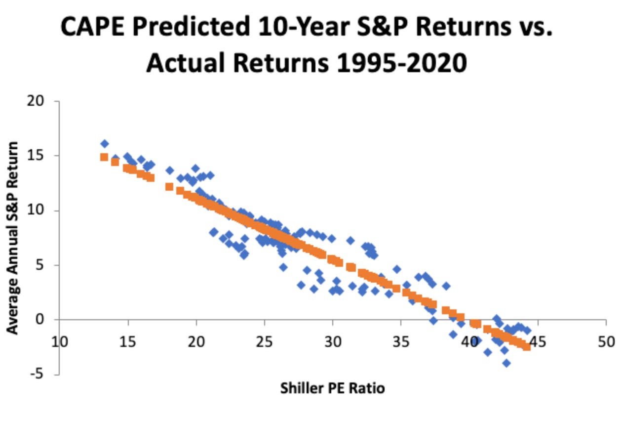
Other periods look even better: measured from 1975, the figure rises to roughly 85%.
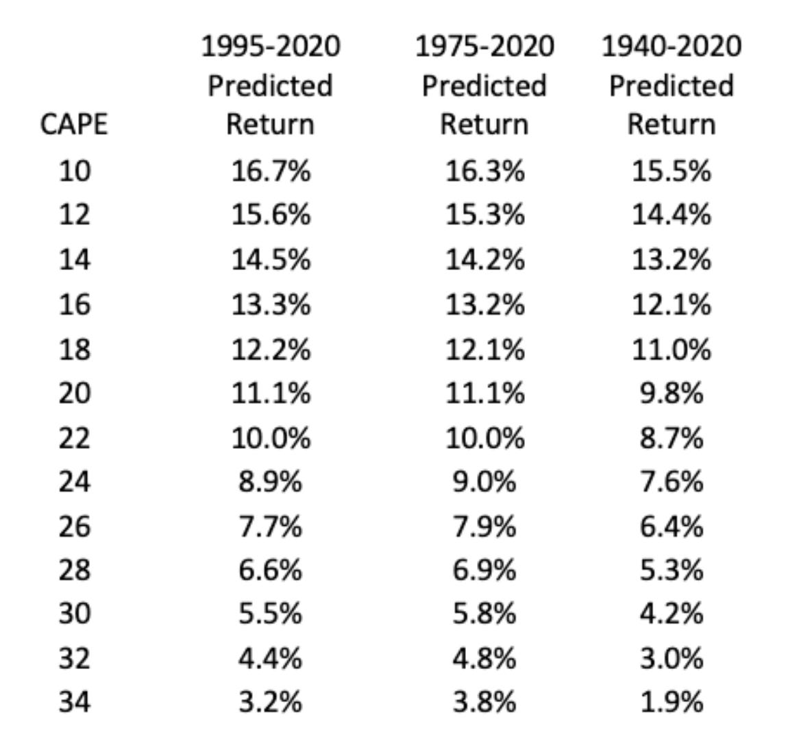
Here’s another cool chart from the source above, showing the expected return on an equity portfolio over the next 10 years based on different CAPE starting multiples.
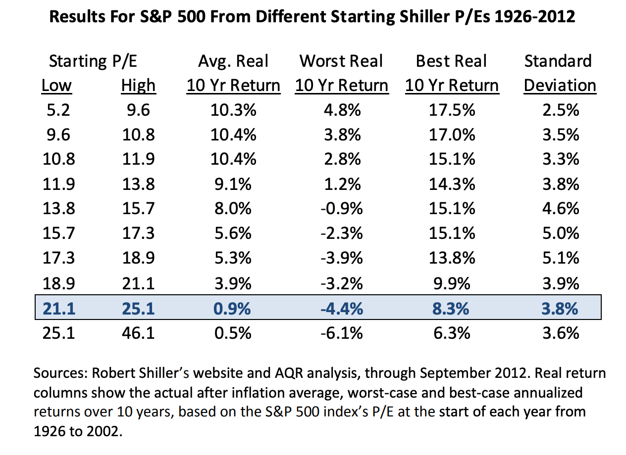
As far as I know, Cliff Asness also ran the direct comparison in his 2012 paper on the Shiller P/E (“An Old Friend: The Stock Market’s Shiller P/E“), testing the one-year P/E against the ten-year version, and found that the smoothed measure did a better job of forecasting long-horizon returns.
He also arrived at a similar conclusion as the authors further above:
“Ten-year forward average returns fall nearly monotonically as starting Shiller P/E’s increase.”
He also makes another important point which I want to stress myself:
“Even with the caveat above, I would, if trading on a tactical outlook, give the Shiller P/E some small weight, particularly when it’s above 30 or below 10.8 But I think this type of analysis is most useful not for a trading strategy but to set reasonable expectations.“
These tools are not timing tools. They simply help set reasonable expectations (in ranges) for very long-term returns.
"Expectation is the root of all heartache."
And one more point from that research paper, as he raises exactly the same controversy I’m raising in this article:
“They point out that we had two serious earnings recessions recently (though only the tail end of the 2000-2002 event makes it into today’s Shiller P/E), including one that was a doozy following the 2008 financial crisis. They thus feel the final (the right end of the graph) strong earnings number is more relevant than that of the prior 10 years. In principle, we must grant that there are times that 10-year earnings may be misleading. They are by no means a panacea. If the last 10 years is much better or much worse than might be expected going forward, the Shiller P/E can indeed be locally “broken” as some would call it now. It’s certainly possible that one-year earnings could give a more accurate picture at such times. The question is, of course, are we in such a time right now? Not surprisingly, if one compares one-year earnings to history, things look much rosier, though the stock market is still not cheap. 11 Instead of a Shiller P/E that is in the 80th percentile versus history right now (expensive), the one-year P/E is in the 54th percentile since 1926 (trivially expensive). So we have to ask ourselves, is the argument against using the Shiller P/E today right? Are the past 10 years of real earnings too low to be meaningful going forward (meaning the current Shiller P/E is biased too high)? Quite simply put, not even close.“
Newer research also speaks directly to my reader’s Wells Fargo objection. The traditional CAPE compares today’s index to earnings produced by a partly different set of companies ten years ago.
A January 2026 working paper by Ma, Marshall, Nguyen, and Visaltanachoti rebuilds CAPE from the bottom up. It computes each current index member's own ten-year CAPE and then weights those by market cap.
“The Component CAPE ratio weights individual stock CAPE ratios by their market capitalization, whereas the traditional CAPE ratio is more closely aligned with earnings weighting.“
“The traditional and widely used approach divides the current index price level, based on the current components of the S&P 500, by the aggregate index earnings reported over the previous 10 years. However, because stocks are added to and removed from the S&P 500 index on an annual basis, there is a mismatch between the stocks used to calculate the price level and those from which historical earnings are derived. We estimate the CAPE ratio by ensuring index alignment between the component stocks in the price numerator and earnings denominator.“
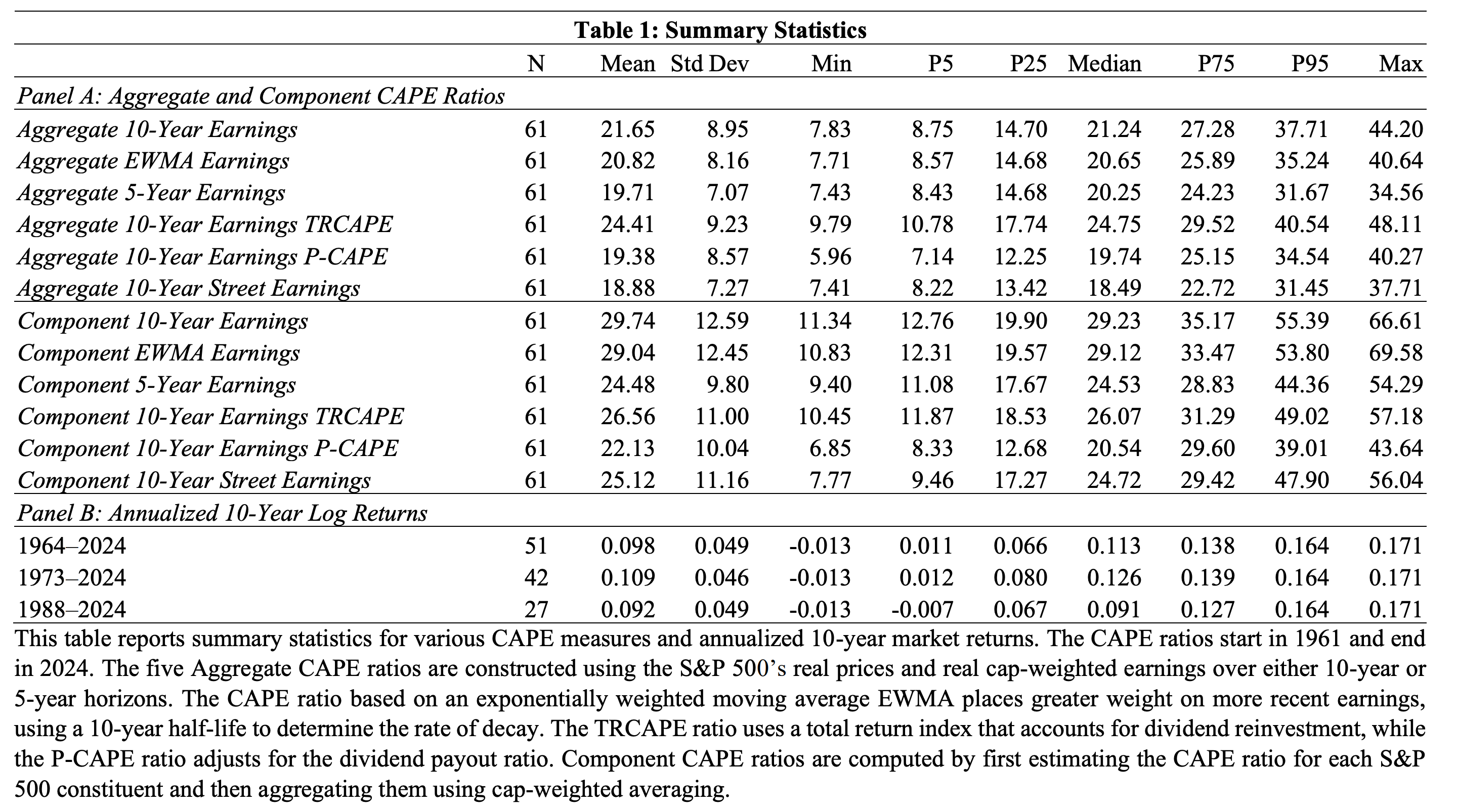
The traditional version turns out to be closer to an earnings-weighted average. The rebuilt measure forecasts ten-year returns better, with an out-of-sample R² of about 58% versus 47% for the standard CAPE over 1974–2015, and it held up better in recent decades.
The twist to consider for this debate is that the improved version consistently reads higher than the traditional one. A more accurate CAPE made the market look more expensive, in fact, not less.
The forward P/E has its own evidence problem, and it’s bigger than most people realize. Its denominator is a forecast from analysts whose estimates have historically tended to start too high and get revised down. That pattern is weaker in strong economies, but it hasn’t disappeared. Right now, FactSet notes that since the end of June, the index has risen 1.8% while the forward 12-month EPS estimate has climbed 8.8%.
The forward P/E looks reasonable partly because expectations have risen faster than prices. That may prove justified. It’s also exactly how a forward multiple looks just before a disappointment.
Weight vs. Strength
A concept from Dale Griffin and Amos Tversky helps me here. In their work on confidence, they separated the strength of evidence (how extreme or vivid it looks) from its weight (how reliable and representative it is).
People overweight strength and underweight weight.
A single dramatic data point feels convincing, while a larger, duller sample gets neglected.
A trailing P/E is one year of profits. It carries plenty of strength and very little weight, since one year can be distorted by a margin peak, a tax change, a write-down, or a pandemic.
CAPE is the opposite: ten years of earnings, adjusted for inflation, so no single boom or bust dominates. It’s heavier evidence, even if it’s slower to register change.
When I can only have one input – remember this is only a thought experiment anyhow –, I would rather rely on heavy evidence that updates slowly than on vivid evidence that swings with the cycle.
That was the core of my answer in the Notes thread, and I still think it holds.
Still, weight comes with a price. The same averaging that protects CAPE from cyclical noise also slows it down when change is structural.
That brings us to theory.
Does the Mean Still Exist?
Every valuation metric compared against its own history rests on an assumption, usually unstated: that there is a stable long-run average for the ratio to revert to.
Statisticians call this stationarity.
If multiples were stationary, extreme readings would be informative, because they tend to fade.
However, multiples are non-stationary, and thus, the historical average is an artifact of a world that no longer exists, and comparing today to 1881 is like comparing a high-speed fiber-optic network to a horse-drawn mail carriage.
There are serious arguments that the market’s underlying attributes have changed. The index today is dominated by asset-light businesses with higher margins, global reach, and far lower capital requirements than the railroads and steel mills that made up the market of Shiller’s early data. Yet, businesses arguably suffer from shorter competitive advantages (depending on the industry; certainly in tech).
Then again, globalization has diversified revenue streams and lengthened growth runways. And if those shifts are durable, then a higher “normal” multiple is justified, and part of the gap between today’s CAPE and its long-run median of about 17 reflects better businesses and better growth opportunities rather than euphoria.
So a question to ask would be whether the last decade’s earnings growth is a new baseline, a “new normal,” or an unusually good stretch. For context, real earnings per share grew about 2.1% a year from 1871 to 2025, and about 2.5% a year from 1950 to 2025. From 2015 to 2025 the rate was about 7.3% a year. From 2016 to mid-2026 it was closer to 9%. Both are flattered by a weak starting point, since 2015 was hit by the energy collapse.
Back to my point. This is where mean reversion comes in, along with its less-discussed twin, mean reversion neglect: our tendency to extrapolate recent trends and forget that competition, regulation, and saturation tend to pull extreme outcomes back toward average.
Michael Mauboussin has done great work in this field. His work on base rates shows that high returns on capital fade over time for most companies, including very good ones. The fade is slower for the best businesses, but it still happens.
His writing on what a P/E multiple actually means also emphasizes that the ratio carries information about where a company sits in its cycle: a cyclical business at peak earnings will look cheap on current profits precisely when its earnings are most at risk. We discussed this above. Apply that logic to an index where the profits of a handful of firms sit near record highs, and a single-year P/E starts to look like a potentially peak-cycle reading.
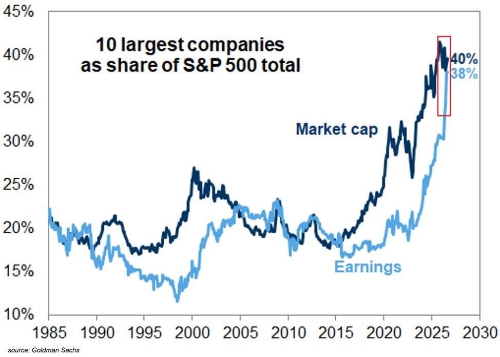
Concentration is the part I find hardest to ignore. RBC notes that the top ten stocks made up a fairly steady 18–23% of the S&P 500 between 1990 and 2015, before nearly doubling to a record 40.7% in 2025.
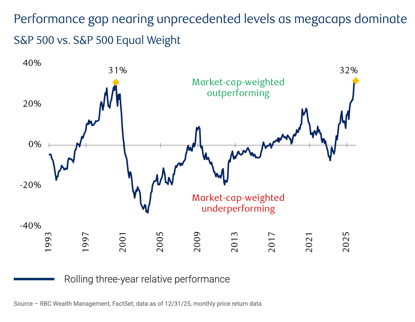
S&P Dow Jones Indices calculated that concentration near 40% hadn’t been seen since the mid-1960s. History suggests leadership at the top of the index rotates.
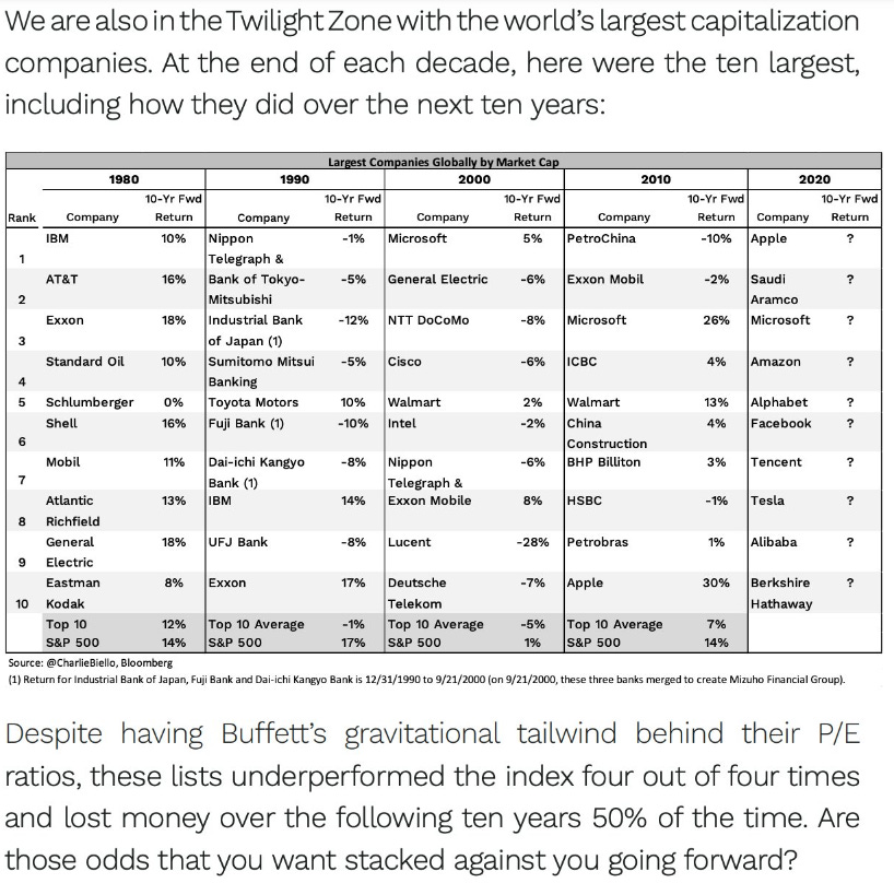
The companies that dominated in 1965, 1980, and 2000 mostly didn’t dominate a decade later.
Saying it won’t be this way going forward is a bet against history, an assessment on the inside view, which tends to be a poor basis for high-quality forecasting.
Also, from 2003 through 2022, the equal-weighted index beat the cap-weighted one by roughly 1.5% a year, a pattern RBC partly attributes to periodic mean reversion among large-cap leaders.
Now link that back to the metric choice. If the earnings of today’s leaders hold up, the regular P/E is the more honest measure and CAPE overstates how expensive the market is.
If those earnings are closer to a cyclical or competitive peak, the trailing figure overstates the durable earnings base, and the regular P/E makes the market look cheaper than it is. In that case, CAPE is the better guide.
You can’t pick a metric without implicitly betting on how durable current profits are. Choosing a ratio means choosing a theory.
Where My Own Argument Cracks
I promised to stress-test my own view, so here is an attempt to invert my line of reasoning.
In the Notes thread, I argued that CAPE’s strength lies in comparing its current level to decades of history. At the same time, I believe multiples are non-stationary and that the attributes of the index today differ enormously from those of the 1920s or the 1970s.
Those two beliefs are in tension.
If the past has little to say about the present, then the long historical record is also the weak point in CAPE’s case.
My best resolution is this. Non-stationarity doesn’t hurt one metric while sparing the other. It also undermines any claim that a trailing P/E of 26 is “high” relative to a 150-year median of 18. Without some historical anchor, neither number means anything. One adjustment is to move the anchor. Compare CAPE against the post-1990 regime of asset-light, globally scaled businesses – weaking the weight of evidence (30-40 years of data is not as great of a sample size as it may seem …) – instead of the railroad era.
But even on that more generous baseline, 41 sits at the very top of the range, and the only comparable readings occurred at the height of the dot-com bubble.
There’s a second crack. I expect concentration to mean-revert, but I can’t prove it, and neglecting mean reversion has a counterpart: extrapolating mean reversion into places where the competitive structure has changed. Some of today’s leaders do have deeper moats and longer runways than their predecessors. If three or four of them sustain their current earnings power and earnings growth for another decade, CAPE will look too pessimistic in hindsight, much as it did through much of the 2010s.
The authors of the RBC Wealth Management paper “The ‘Great Narrowing’: S&P 500 concentration“ that I referenced above also point out exactly this, which is in line with FJ’s reasoning, I think:
“It is important to acknowledge that today’s concentration is not purely speculative and, unlike prior market peaks, the largest constituents of the S&P 500 are highly profitable businesses with strong balance sheets, durable competitive advantages and substantial free cash-flow generation. Many are returning capital to shareholders while continuing to invest heavily in growth, particularly in AI-related products and infrastructure.
Elevated concentration alone is not sufficient evidence of a bubble. Market leadership has narrowed in part because earnings, margins and cash flow have narrowed. That distinction matters and helps explain why valuations have been elevated for longer than many investors anticipated.“
Concluding Thoughts
If I could keep only one number, I would keep the Shiller PE. It carries more weight as evidence, it’s less exposed to where we are in the earnings cycle, its forecasting record is stronger over the horizon that matters for long-term investors, and recent research (with some twists to the metric!) has made it more robust to the very composition problem raised against it; now we only need websites to report it too.
The regular P/E, especially the forward version, rests on one year of profits or on one year of forecasts. In a market where ten companies make up close to 40% of the index, that is a narrow foundation.
The asterisk is important, though. I’d use CAPE to set my expectations for the next decade and not to decide what to do next month. I’m an active stock picker anyhow, and while in expensive environments it may be harder to find “no brainers,” I’d argue that if you only look hard enough, you can still find “gems” in almost every environment.
US market valuation levels seem high. Outside the US, I see lots of opportunities.
Where my reader and I disagree, I believe, is simply on how much of the last decade’s profit growth and the current index composition (in its weight) will prove permanent.
So what did you pick before you started reading, and did anything here change your mind?
Leave a second comment if it did. If you think I’ve got it wrong, I especially want to hear from you.
Great to see I inspired that debate!
First, I am not against Cape-Schiller ratio and I obviously agree the higher the starting valuation the lower the expected return.
No debate here.
My point was to take Cape-Schiller as the starting with a grain of salt currently due to what happened in the last 10 years vs what usually happens to earnings over a 10 year period.
When you overlap p/e and Cape-Schiller graphs you see an obvious overlap, except for the last 10 years. This is just weird to completely ignore that anomaly de facto.
Total earnings of S&P 500 in 2015 were at ~800M and they are at $2.5T now.
That's a 12% CAGR over a decade.
And that's absolute earnings not taking into account the record decade of buybacks.
I understand what happened on the past 120 years, but does it really make sense to start a valuation at the average between $2.5T and $0.8T?
It feels like this would be like looking at climate change and ignoring the accelerated heating of the past decades and sticking with the average decade change of the past 300 years. And saying the starting level is the average between now and 1976... it wouldn't make any sense. Because recent years did happen and we are now at a new point in time.
I'm not saying the last decade will repeat: I have no idea. I simply don't think the valuation starting line for today should be measured by the average of last 10 years.
It's not to brush it off completely and it's obviously always good to be prudent and aware of the risks. It's more to say it is not an absolute indicator and not one to take immediate action upon. If we look at Cape-Schiller ratio, it was already at all-time (non-2000) peak level in 2018... 150% ago.
I do agree with your points about index concentration and index concentration is the reason I buy individual stocks personally.
But the mega-caps have been growing at never-seen before pace for mega-caps. And years after years. They did it, it's done and it lead us that earnings level now.
One minor last point: I know we have data since 1871 but I really think finances got more efficient since. With 100+ years of data now, it has been demonstrated thousands of times that equities outperform fixed income over time. I think markets acknowledged that information and is giving higher multiples to equities now vs 30-50 years ago because of all these studies showing the risk over time isn't that much greater than fixed income vs the reward. This needs to be taken into consideration I think.
Thanks for the write-up and debate!
TL/DR:
Yes Cape-Schiller can be a good datapoint to consider, but I think we need to adjust some things to take into consideration the situation we are in right now.
P.S. About the evidence test: be caution about plot lines that are overlapping data and are autocorrelated.
The dot for Jan 1995 -> Jan 2005 and the one for Feb 1995 -> Feb 2005 are not 2 independent events. They share more than 99% the same date (119 months out of 120).
This creates the illusion of sample size but the graph will obviously correlate by design. It's a no-no in statistics to demonstrate correlation...
Regression-type studies are cool but may miss the mark because Shiller cape seem to be most interesting and useful at extremes. And the current cape is extreme across both entire history since 1871, and across rolling 10, 20, and 30 year windows. Meaning even if we grant "regime change", market is expensive within the current regime.
As for common sense, excess cape yield is now sub 1. Which is the big difference compared to 2020. In fact, if one uses 10 year tip as real risk free benchmark, the ecy is already negative. Buying equities at thin to negative risk premium seems weird, but hey, Japan did it before!
Earnings - am wondering if anyone has actually looked if past 10 year real earnings CAGR - by either the cape earnings or the spot - actually outperformed the past significantly or still within the top-bands set by the 1950s smokestack America businesses.