
How I Built My Investing Dashboard on Koyfin (And Why It Changed My Process)
My One-Click System for Analyzing Any Stock (Step by Step with Examples)

I’ve always found that numbers alone rarely tell the full story. A table of data can be precise, but it’s often difficult to see patterns, trends, or anomalies without some form of visualization.
That’s where charting comes in.
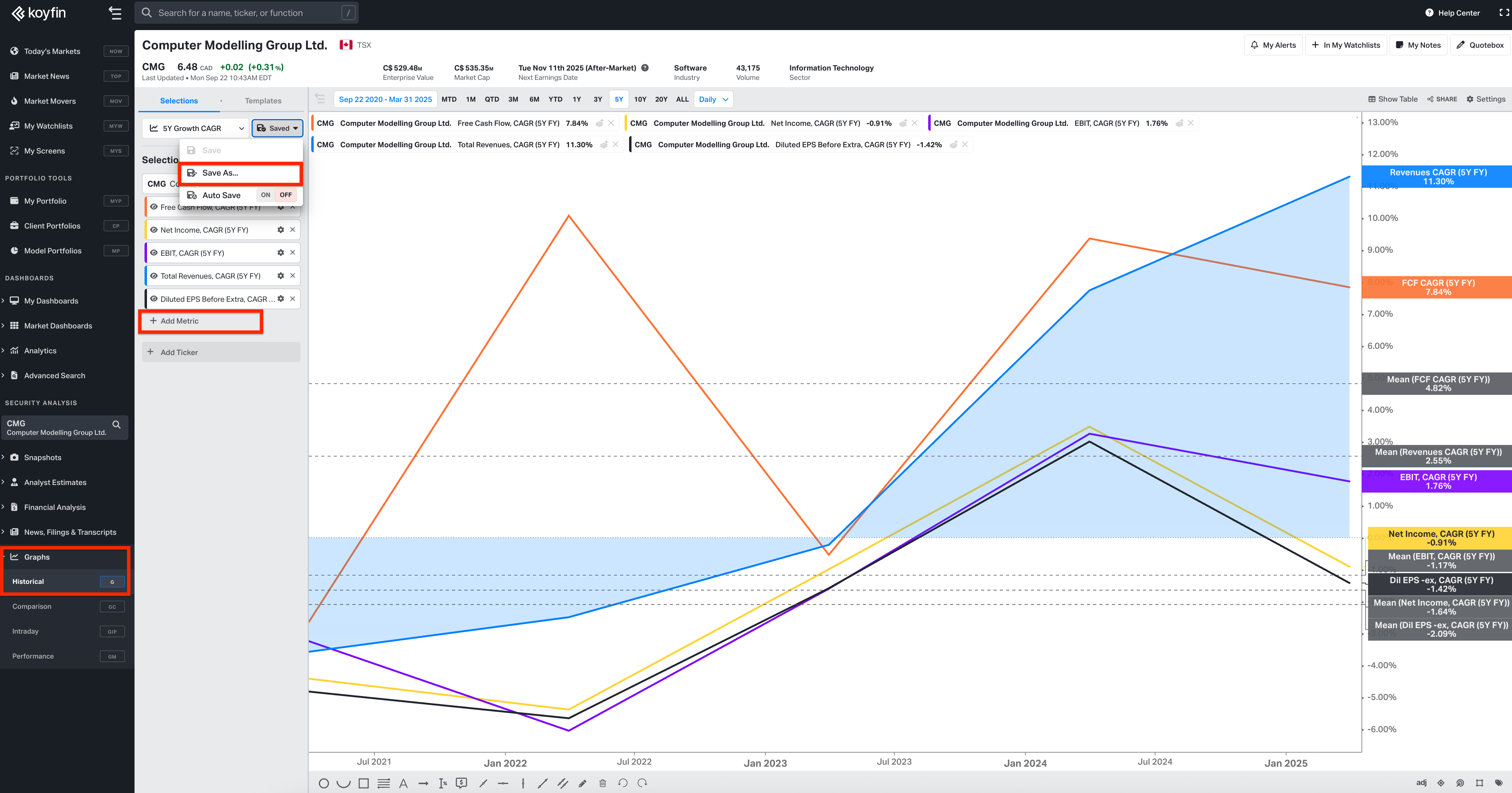
For me, Koyfin has been a real game changer – not just because of the sheer breadth of data it covers, but because of how easy it makes it to build, customize, and save chart templates. With one click, I can pull up a view I’ve fine-tuned to answer specific questions, whether it’s about company fundamentals, price drawdowns, or relative performance.

Charting has traditionally been seen as the realm of traders. Think technical analysis, moving averages, and support lines. But I’d argue it can be just as valuable – maybe even more so – for long-term, fundamentally oriented investors.
The ability to look at historical sequences of data, to overlay multiple series, or to compare developments across time and peers brings clarity that a spreadsheet of raw numbers simply doesn’t. For me, it often sparks the kind of insights that feed directly into my investment process.
In this post, I want to walk you through the 14 charting templates I’ve set up on Koyfin and actually use in my day-to-day research. If you have any questions about how to set them up, just drop a comment below.
These aren’t abstract examples – they’re the exact views I return to again and again. To make things more concrete, I’ll illustrate them using Duolingo, a company I’ve written about recently. By the end, you’ll have a sense not only of how I structure my charts but also of how powerful it can be to have the right visualizations ready at your fingertips.
Read my latest thoughts on DUOL 0.00%↑ here:
Duolingo vs. the Translation Machines – Will AI Kill Language Learning & If So, When?

When I pull up a 5-year price chart of Duolingo, it’s hard not to notice how much of the story depends on where you set the starting point. At one end, you see a stock that has returned 107% – a decent run, outperforming the S&P by around 700 bps. But, if you adjust the timeframe by just a few days (see the chart below), the number drops to ~36%. That's the nature of endpoint sensitivity.
My 14 Charting Templates
Template #1 Headlines Numbers
The first template I always pull up is what I call my “headline numbers” view. It’s the chart that anchors my understanding of a business at the highest level – revenues, EBIT, net income, and free cash flow. I want to see them all in one place because together they tell me whether topline growth is translating into real economics or if it’s just topline momentum.
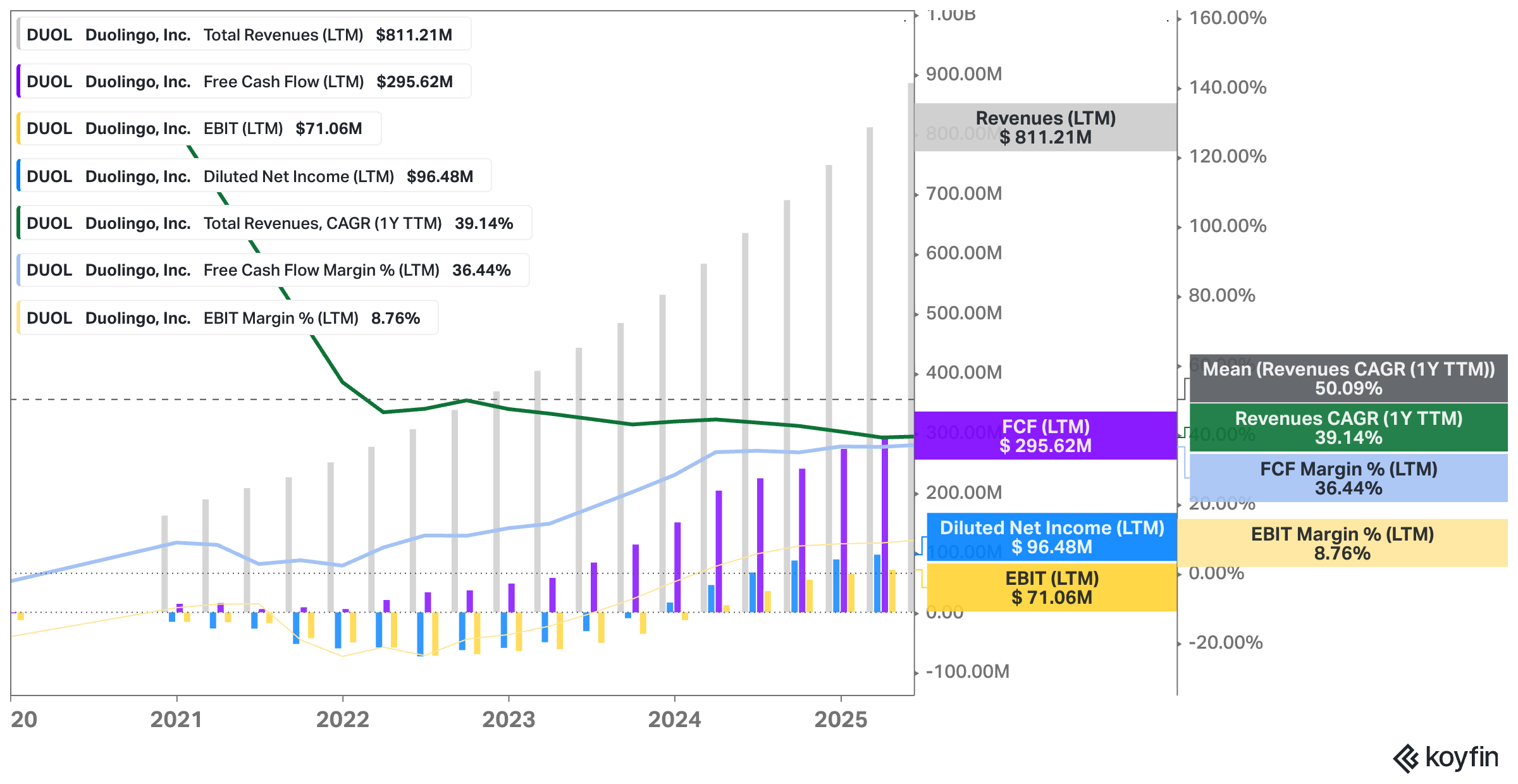
Take Duolingo. The company has scaled revenues to over $800 million on a trailing twelve-month basis, and the growth rate has been extraordinary – north of 40% YoY in most years, still 39% recently, and closer to 50% if you take the mean across the last couple of years; I find the “mean” statistical band a true game changer fwiw.
That kind of revenue and profit expansion is impressive on its own, but the real story is what sits beneath it: free cash flow margins running in the mid-30s. For a business still early in its monetization journey, that combination of growth and profitability is exceptional.
What the chart also makes clear is the spread between the different earnings lines. EBIT margins are still in the single digits, reflecting at least partly stock-based compensation-related expenses. Free cash flow (unadjusted for SBC), by contrast, is much stronger, which says a lot about SBC but also the capital-light nature of the business and the negative working capital dynamics at play.
For a fundamental investor, this is exactly the kind of picture you want to have at your fingertips – one chart that condenses growth, profitability, and cash generation into a coherent snapshot so you can decide whether this company deserves a closer look.
Template #2 Free Cash Flow
If the “headline numbers” chart gives me the big picture overview, this free cash flow template zooms in on what really matters for long-term shareholders: the company’s ability to turn accounting profits into real, distributable cash.
Ultimately, you want to combine it with the template focused on the shares outstanding (template #9) – because ultimately, FCF per share growth will determine a stock’s trajectory.
This chart pulls together revenues, cash from operations, capital expenditures, and stock-based compensation – and then ties them into free cash flow levels, margins, and growth rates.
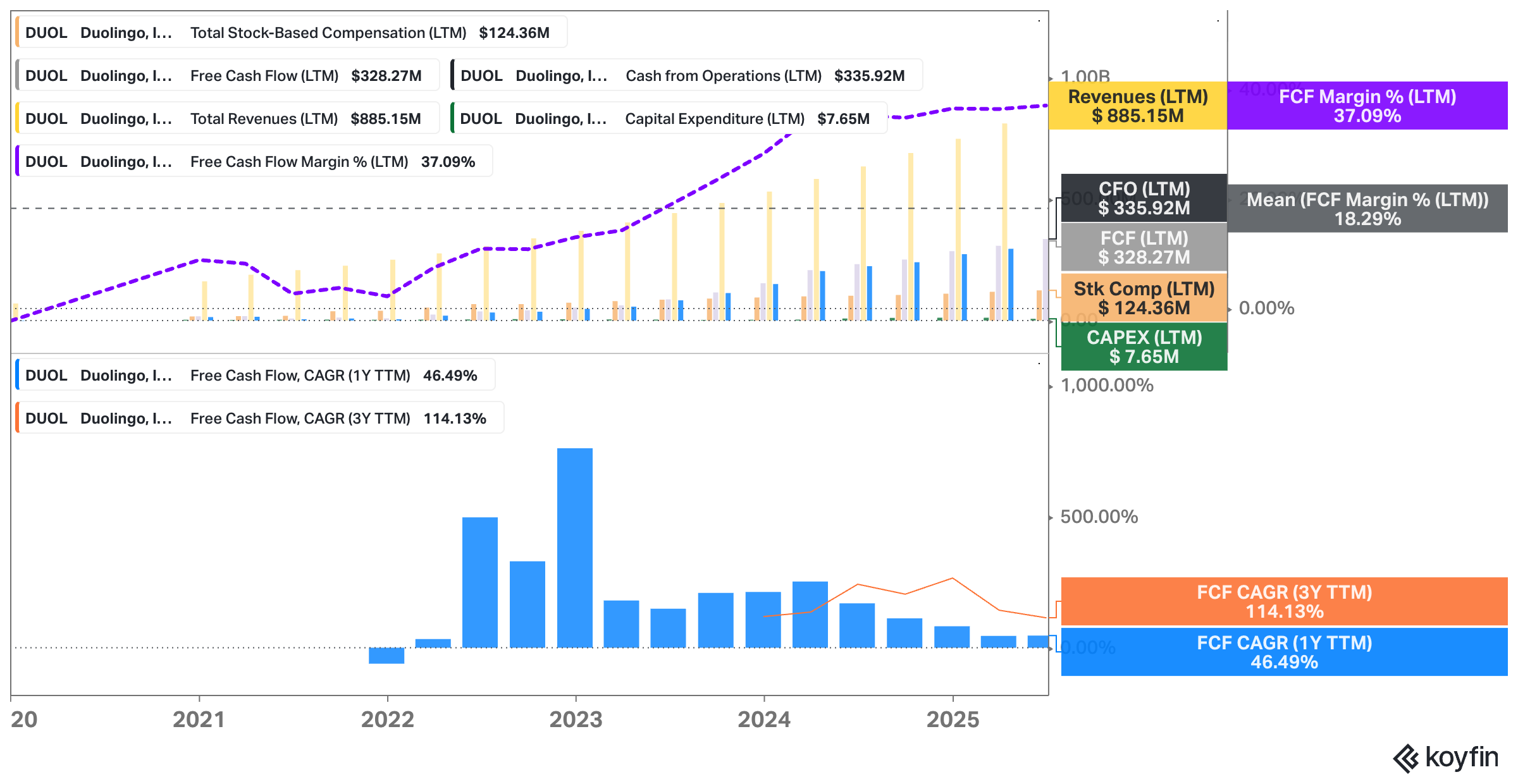
Looking at Duolingo, the story that jumps out is how clean the cash generation profile has become. Revenues are approaching $900 million, but what matters here is that cash from operations sits above $330 million, with capital expenditures of less than $8 million. That light CapEx burden is one of the defining features of Duolingo’s business model. It means that most of the cash flow is truly free, and not tied up in heavy reinvestment just to keep the lights on. The result is free cash flow margins north of 35% – roughly double the company’s own historical mean —> operating leverage at play.
Related to this is the growth trajectory. Over the last year, FCF grew at nearly 50%, and if you stretch the timeframe out to three years, the compound annual growth rate is over 100%. That kind of scaling is hard to find, especially when it comes with high incremental margins.
Of course, stock-based compensation – at more than $120 million – is a real cost for shareholders and one I keep a close eye on. But even accounting for dilution, the underlying economics are very strong.
This is why I like to have this chart saved as a one-click template. It forces me to ground any investment thesis in the cash reality of the business, not just in the revenue excitement or headline earnings figures.
For Duolingo, the chart illustrates exactly why some investors are willing to pay a premium multiple: it’s a business that converts growth into cash at scale and the cash generation machine is growing.
Template #3 Margin Profile, Intangible Investments & ROIC
Margins are where the story of a business model really reveals itself, which is why I keep a dedicated template to look at a company’s profitability profile in more detail, and most importantly, over time.
One of the most common valuation mistakes I see is investors over- OR underestimating “true” (steady-state) profitability of a business. Of course, getting this right requires qualitative work, but looking at the historical profile over time, is a good starting point too.
So in this chart, I can see gross margins, operating expenses as a percentage of revenue, the progression of EBIT and net income margins, as well as free cash flow margins. I also overlay R&D intensity, CapEx levels, SG&A expenses (or investments; this requires qualitative work), and return on invested capital (ROIC) to get a sense of how efficient the company is at turning investments into returns.
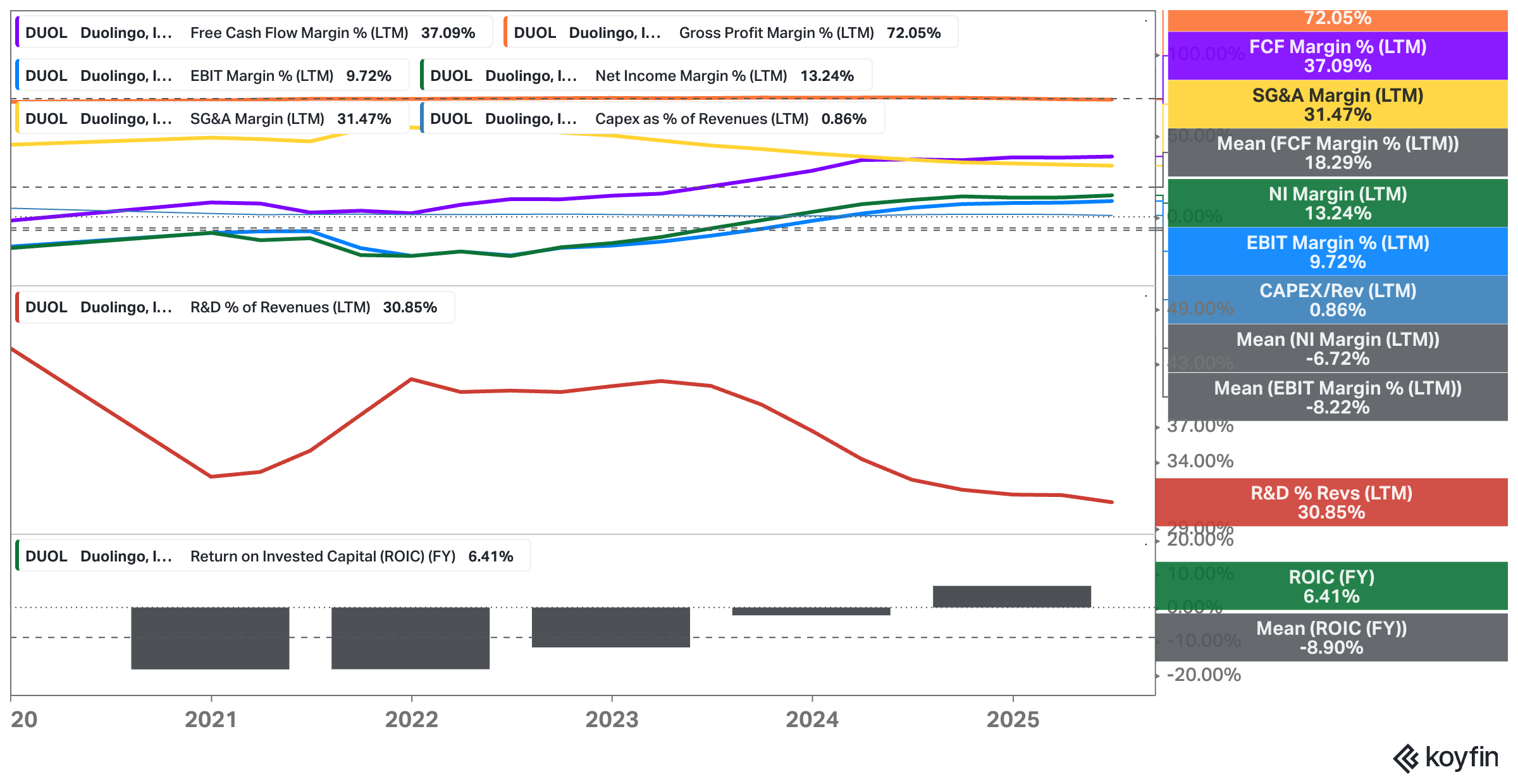
For Duolingo, the first thing that stands out is just how strong and stable the gross margins are – north of 70%. That reflects the digital nature of the product: once the platform is built, adding more learners comes at almost no incremental cost. The challenge is further down the P&L. R&D sits at more than 30% of revenues, which isn’t unusual for a young, product-led company, but does hold back operating leverage (for now). But operating leverage has at least started to kick in a little bit as R&D investment scaled down from >40% back in 2023. SG&A runs another 30% of revenues, so while Duolingo is scaling, it’s still early in the margin expansion journey.
ROIC, at around 6%, is only just starting to move into positive territory – again, I’d consider this normal for a business in this stage of the corporate life cycle. Given Duolingo’s limited capital intensity, I’d expect that number to climb as the company grows into its cost base.
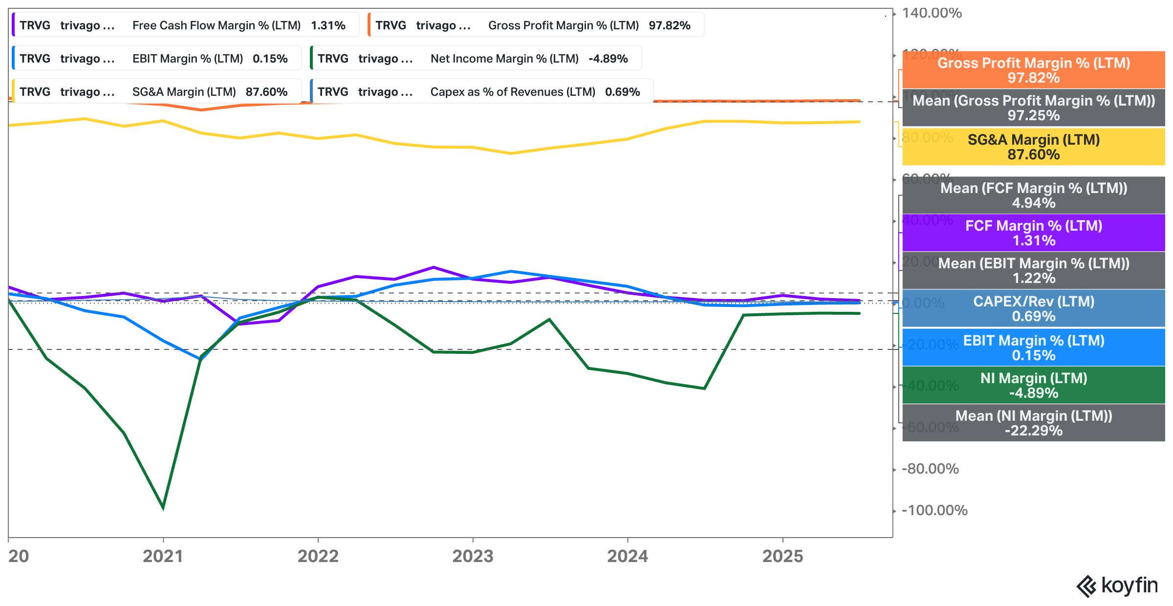
This chart is useful because it keeps me honest. It’s easy to get excited about high gross margins, but until SG&A and R&D moderate as a percentage of sales, operating margins will remain compressed. Consider this chart of trivago, for instance, where SG&A expenses represent almost 90% of revenue which is strongly tied to the business model:
Template #4 Valuation Multiples
Valuation is where everything ultimately comes together. No matter how strong the growth or how attractive the margins, the question for investors is always the same: what am I paying for this business?
My valuation multiples template lays out the key multiples – EV/EBIT, P/E, P/FCF, EV/Sales, and PEG – both on a trailing and forward basis. I also track free cash flow yield, dividend yield, and shareholder yield (dividends + buybacks) to get a sense of how much value is actually flowing back to investors.
Looking at Duolingo, there’s no denying the premium the market is demanding. On trailing numbers, the stock trades at more than 100x earnings, nearly 40x free cash flow, and over 13x sales. Of course, you have to tie these numbers to the current vs. historical vs. projected margins. I bought Wix.com at an almost infinite earnings multiple, for example, because I had high conviction in the business becoming structurally extremely profitable once it enters a later stage in its business life cycle.
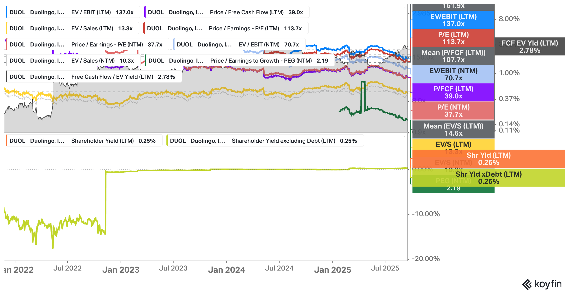
Forward estimates bring the Duolingo multiples down somewhat, with P/E dropping into the 30s and EV/EBIT into the 70s, but these are still lofty levels. The PEG ratio, at a little over 2, gives some context: growth helps justify part of the valuation, but investors are clearly betting on sustained momentum.
The free cash flow yield tells another part of the story. At under 3%, it’s thin – especially when you consider what else investors could earn in today’s interest rate environment. Shareholder yield, at just a quarter of a percent, reflects the fact that Duolingo is reinvesting most of its cash back into the business rather than paying dividends or buying back stock. If the company were to initiate a dividend, it would show up in the lower part of this chart, alongside buybacks, giving a quick visual of how much capital – relative to the current price – is being returned.
This is one of my favorite templates because it forces me to look at valuation not in isolation but across multiple angles. A stock can look expensive on earnings but reasonable on free cash flow, or cheap on sales but expensive on EBIT. Having them all in one place, plotted against history, makes it much easier to judge whether a business is truly priced for perfection or if there’s hidden value the market is missing.
The full story starts here:
The rest of this post covers the other 10 templates I’ve set up. If you’re serious about sharpening your investing edge, the full post (and all my previous premium content, including valuation spreadsheets, deep dives (e.g. Duolingo, a 12x EBIT Royalty Business, Tiger Brokers, LVMH, Edenred, Digital Ocean, Zalaris, or Ashtead Technologies), and powerful investing frameworks) is just a click away. Upgrade your subscription, support my work, and keep learning.
Just to give you a heads up, I will also raise prices in October.
PS: Using the app on iOS? Apple doesn’t allow in-app subscriptions without a big fee. To keep things fair and pay a lower subscription price, I recommend just heading to the site in your browser (desktop or mobile) to subscribe.