
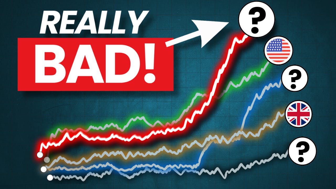
The World's Most Expensive Stock Markets: A Look at Global Valuations!
Stock Markets to AVOID in 2024?

Have you ever wondered which stock markets in the world are the most expensive? You might immediately think of the US stock market, but the truth is, there’s more to this global story than just the U.S. markets.
Investors worldwide are pouring money into markets that appear highly overvalued, often leading to puzzling questions: Why are people still investing in these markets despite sky-high valuations? And what does this mean for future returns? Do they understand the relationship between valuation and expected future returns?
In this blog post, we’ll take an in-depth look at the current landscape of global stock market valuations. We'll explore valuation metrics like the Shiller-CAPE ratio and the price-to-book ratio, discuss why these metrics can be problematic, and most importantly, understand what this means for investors in the years to come.
Introduction: Breaking Down Global Valuations
Valuation is critical in understanding stock market investing, especially if you're looking at individual stocks. Arguably, understanding valuation is less relevant if you’re a passive investor investing in entire national markets, but understanding the impact of high (or low) valuation levels on future returns isn’t going to harm you.
The two key metrics to measure stock markets’ valuation that we’ll focus on in this article are the Shiller-CAPE ratio and the price-to-book ratio, both of which provide insights into how richly (or cheaply) different stock markets are priced. While these metrics have been staples for value-oriented investors for decades, we’ll also discuss why one of the two metrics might be losing some of its relevance in modern markets dominated by intangible assets and technology companies.
But first, let’s start by looking at the actual data.
The Data: Insights from Norbert Keimling
The data I’m sharing today comes from Norbert Keimling, a German value investor who works at Taunus Trust, a German investment company. Keimling is known for his detailed analysis of stock market valuations, and he recently shared some fascinating charts on his X (formerly Twitter) profile.

The charts that I will share below provide a comprehensive view of national stock market valuations using two key metrics: the Shiller-CAPE ratio and the price-to-book ratio.
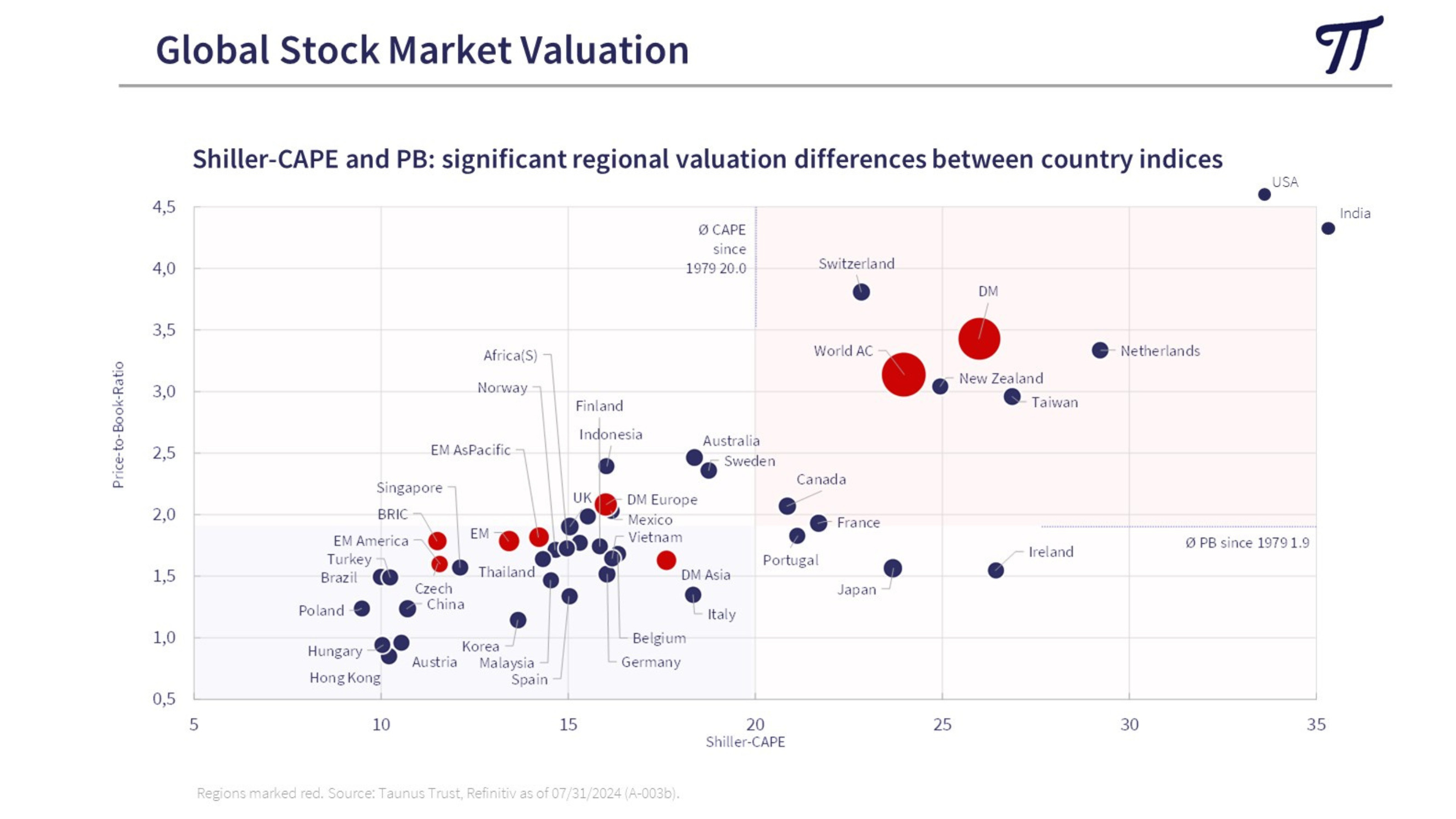
(Source: Norbert Keimling; Taunus Trust)
The chart structure is fairly straightforward but informative.
The blue dots represent individual national stock markets and the red dots represent various indices like developed markets (DM) and emerging markets (EM).
On the x-axis, we have the Shiller-CAPE ratio, which measures the cyclically adjusted price-to-earnings ratio of various stock markets. It is one of the most widely used valuation metrics, especially for long-term stock market analysis, and was developed by Nobel Prize-winning economist Robert Shiller. This ratio adjusts the standard price-to-earnings (PE) ratio by using inflation-adjusted earnings over the last 10 years. By smoothing out earnings volatility, it provides a clearer picture of whether a stock market is historically overvalued or undervalued.
A higher Shiller-CAPE ratio indicates a more expensive market, where investors are paying a premium for future earnings.
A lower Shiller-CAPE ratio suggests a cheaper market, potentially offering better long-term returns.
This axis helps us identify which markets are more expensive or cheaper based on long-term earnings trends.
As shown, historically, the global average Shiller-CAPE ratio has been around 20x, and this serves as a useful benchmark when assessing today’s market conditions.
On the y-axis, we have the price-to-book ratio, a metric that compares a stock market's price to the book value of its companies, where book value equals a company’s assets minus its liabilities. Traditionally, value investors, including legendary figures like Warren Buffett during his early "cigar butt" investing days, looked for companies with a price-to-book ratio below 1. This was considered a key indicator of undervaluation, suggesting the market was pricing the company for less than its net assets.
The y-axis in the chart thus provides another layer of understanding about how richly or cheaply the markets are priced from a value investor’s perspective.
Historically, the global average P/B ratio has been around 1.9x.
However, in today's market, dominated by technology and platform businesses, this metric is becoming less relevant. Companies like Airbnb and Meta don't rely heavily on physical assets but on intangible assets like data, intellectual property, and networks. This shift means that many companies, while having high price-to-book ratios, may not necessarily be overvalued. We’ll explore this idea further later in the post.
Global Stock Markets: The Data Speaks
Now, let’s turn our attention to the specific markets that are most overvalued today.