
Deep Dive: An Untapped Basket Trade
What Europe’s equity gap could say about one of the easiest long-term trades hiding in plain sight

A few days ago, a friend sent me a chart from Goldman Sachs that I can’t get out of my head. It was one of those visuals that looks deceptively simple at first glance but becomes more intriguing the longer you stare at it – or think about it.
The chart compared how households across major economies allocate their wealth, and Europe’s position on that spectrum was hard to ignore.
What fascinated me wasn’t just the numbers themselves but what they implied about behavior – about how people save, invest, and prepare for the future. The longer I looked at it, the more it started to feel like the chart wasn’t merely describing the world as it is, but hinting at how it might change.
At first, it was just a gut reaction. But then, as usually happens, I started turning the idea around in my head, asking myself what hidden assumptions sit behind it.
Why has this imbalance persisted for so long?
What might cause it to narrow – or even reverse?
And if it does start to shift, who or what might be positioned to benefit most from that change?
That’s how most of my writing begins: one chart, one curiosity, and a growing stack of questions. The more I thought about it, the more I felt that this single image might capture one of the easiest long-term investment setups available today – a theme that you could back, hold, and revisit years later with a quiet sense of satisfaction.
But as always, the story gets richer once you start unpacking it. So let’s do that.
Here’s an overview of topics covered
How a single chart from Goldman Sachs sparked a chain of thought about a persistent imbalance in how households across major economies allocate their financial assets.
What exactly the chart shows: the long-term divergence between regions and why that divergence has endured for decades.
Why such gaps in behavior rarely exist without structural or policy reasons behind them.
The demographic and institutional backdrop in Europe that may be forcing a rethink of how citizens save and invest for retirement.
The broader macro and political conversation around creating deeper, more unified capital markets in Europe.
A series of supporting data points from OECD, AFG, and other studies confirming the scale and persistence of the participation gap.
The distinction between first-order and second-order thinking when interpreting a chart like this – and why the obvious conclusion is rarely the full story.
Introduction of an investable universe tied to this theme – businesses and regions positioned to benefit if the trend begins to reverse.
Quantitative context illustrating scale differences, profitability profiles, and valuation dispersion among those potential beneficiaries.
The idea that structural imbalances of this kind, once they start to correct, often do so gradually at first and then all at once.
Closing reflections on why such slow-burning, behavioral transitions can create unusually asymmetric long-term opportunities.

Disclaimer: The analysis presented in this blog may be flawed and/or critical information may have been overlooked. The content provided should be considered an educational resource and should not be construed as individualized investment advice, nor as a recommendation to buy or sell specific securities. I may own some of the securities discussed. The stocks, funds, and assets discussed are examples only and may not be appropriate for your individual circumstances. It is the responsibility of the reader to do their own due diligence before investing in any index fund, ETF, asset, or stock mentioned or before making any sell decisions. Also double-check if the comments made are accurate. You should always consult with a financial advisor before purchasing a specific stock and making decisions regarding your portfolio.
Reading Between the Lines of the Chart
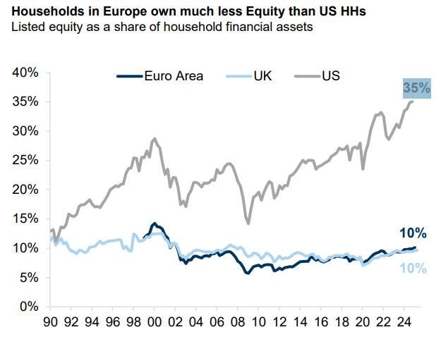
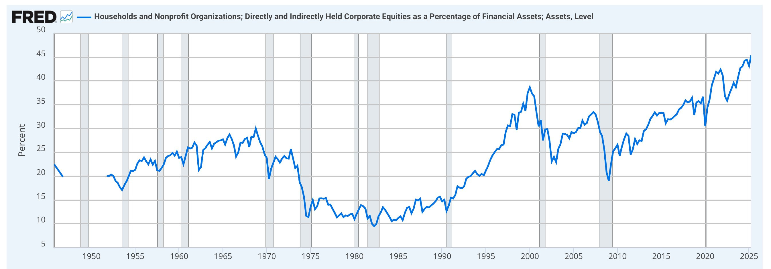
Let’s be precise about what the chart shows. It tracks the share of listed equities within household financial assets across three regions since the early 1990s. On that measure, the United States pulls away decisively. The US line trends higher over the decades, with the expected zigs and zags around the dot-com era, the GFC, and the post-COVID surge, and it now sits near 35%. In fact, according to Federal Reserve Economic data, the % may even be higher.
Europe tells a very different story. The Euro Area hovers in a narrow band for most of the period, rarely breaking out, and ends around 10%. The UK, despite its market-friendly reputation, also sits near 10% today after a long slide from higher levels in the late 1990s.
Two things jump out. First, the gap is persistent. Through cycles, crises, and product innovation, the US steadily deepened household equity participation while Europe remained flat.
Second, the magnitude of the gap matters. A 25-point difference is not a footnote. It reflects behavior, institutions, incentives, and policy choices that compound over time!
It’s tempting to read this as a simple story about preferences. But there are layers. Some of the divergence is cultural. Some is structural – the way retirement saving is organized, how tax wrappers work, and the ease of accessing public markets. Some is mechanical. When property prices command a larger share of wealth, equities appear smaller as a percentage even if nominal ownership rises.
None of that negates the core fact the chart is shouting: on this specific measure – listed equity within financial assets – Europe has barely moved in three decades and the gap to the US is material.
If you stop there, it’s a curiosity. If you keep thinking, it starts to look like a slow-moving imbalance that can, at some point, begin to correct. The interesting questions live in the how and the when.
What would have to change in policy or behavior to nudge Europe off this plateau? If that shift begins, where would the incremental flows show up first? And how would they propagate through the system over years rather than quarters?
That’s where the story gets interesting for investors!
The Structural Catalyst: Europe’s Retirement Reckoning
This is where it gets interesting!
Become a paying subscriber to read the rest of this post and get access to all of my other research, including valuation spreadsheets, deep dives (e.g. well-known mid- and large caps such as LVMH, Duolingo, Meta, Edenred as well as more hidden gems such as Tiger Brokers, Digital Ocean, Ashtead Technologies, InPost, Timee, and MANY more), and powerful investing frameworks.
Annual members also get access to my private WhatsApp groups – daily discussions with like-minded investors, analysis feedback, and direct access to me.
PS: Using the app on iOS? Apple doesn’t allow in-app subscriptions without a big fee. To keep things fair and pay a lower subscription price, I recommend just heading to the site in your browser (desktop or mobile) to subscribe.